- #135
- #134
- #133
- #132
- #131
- #130
- #129
- #128
- #127
- #126
- #125
- #124
- #123
- #122
- #121
- #120
- #119
- #118
- #117
- #116
- #115
- #114
- #113
- #112
- #111
- #110
- #109
- #108
- #107
- #106
- #105
- #104
- #103
- #102
- #101
- #100
- #99
- #98
- #97
- #96
- #95
- #94
- #93
- #92
- #91
- #90
- #89
- #88
- #87
- #86
- #85
- #84
- #83
- #82
- #81
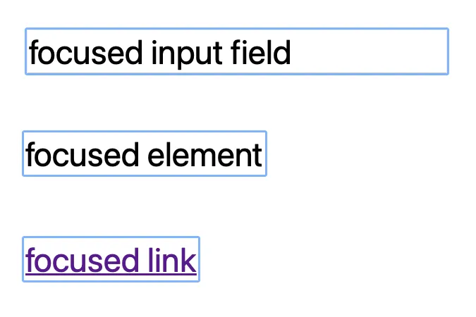
Why does a blue outline appear when pressing a browser tab?
Recently, the designer reported that some interactive elements on the website show a blue outline when focused, and hopes to remove it. However, before removing it, I think it is necessary to discuss the reason behind it.
The blue outline is specifically called Focus Indicators, and it is also referred to as Focus Ring or Focus Outline. Its purpose is to help users easily locate the content that is currently focused on the webpage, usually providing clearer indications for users with visual impairments or those who navigate the webpage using a keyboard.
Browsers and major style libraries typically have this style pattern built-in to ensure the usability of webpages, which is why there is a blue outline by default when elements are interacted with. Of course, this standard is not absolute; it can be adjusted according to the needs of the website’s user, but it can be confirmed that designs that emphasize usability requirements pay more attention to ensuring that the basic functionality of styles can be correctly identified.
Ultimately, a consensus was reached, to remove the weird Focus Ring and enhance the contrast of borders. 👍

- #80
- #79
- #78
- #77
- #76
- #75
- #74
- #73
- #72
- #71
- #70
- #69
- #68
- #67
- #66
- #65
- #64
- #63
- #62
- #61
- #60
- #59
- #58
- #57
- #56
- #55
- #54
- #53
- #52
- #51
- #50
- #49
- #48
- #47
- #46
- #45
- #44
- #43
- #42
- #41
- #40
- #39
- #38
- #37
- #36
- #35
- #34
- #33
- #32
- #31
- #30
- #29
- #28
- #27
- #26
- #25
- #24
- #23
- #22
- #21
- #20
- #19
- #18
- #17
- #16
- #15
- #14
- #13
- #12
- #11
- #10
- #9
- #8
- #7
- #6
- #5
- #4
- #3
- #2
- #1