- #135
- #134
- #133
- #132
- #131
- #130
- #129
- #128
- #127
- #126
- #125
- #124
- #123
- #122
- #121
- #120
- #119
- #118
- #117
- #116
- #115
- #114
- #113
- #112
- #111
- #110
- #109
- #108
- #107
- #106
- #105
- #104
- #103
- #102
- #101
- #100
- #99
- #98
- #97
- #96
- #95
- #94
- #93
- #92
- #91
- #90
- #89
- #88
- #87
- #86
- #85
- #84
- #83
- #82
- #81
- #80
- #79
- #78
- #77
- #76
- #75
- #74
- #73
Thinking About Web Layouts from a Two-Dimensional Perspective

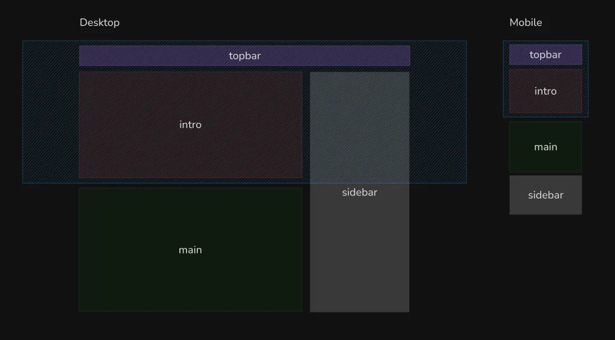
Recently, I encountered a requirement to implement a responsive webpage as shown in the image below. It became clear that this layout could not be achieved using traditional one-dimensional layout methods, as the containers they belong to differ between the two sizes.
For example, the sidebar should be contained within the main parent container, but it also needs to align with the top of the intro on larger device sizes. Clearly, such a requirement is difficult to achieve with traditional CSS layouts. Whether using negative
marginto push elements, orabsolute,transform, it can quickly become chaotic and hard to maintain, even requiring JavaScript to calculate positions 😐.After resolving this with CSS Grid and Subgrid, I felt it was a great case study, so I wrote a complete article: CSS Grid Real Use Case: The Process of Creating an Extended Sidebar
- #72
- #71
- #70
- #69
- #68
- #67
- #66
- #65
- #64
- #63
- #62
- #61
- #60
- #59
- #58
- #57
- #56
- #55
- #54
- #53
- #52
- #51
- #50
- #49
- #48
- #47
- #46
- #45
- #44
- #43
- #42
- #41
- #40
- #39
- #38
- #37
- #36
- #35
- #34
- #33
- #32
- #31
- #30
- #29
- #28
- #27
- #26
- #25
- #24
- #23
- #22
- #21
- #20
- #19
- #18
- #17
- #16
- #15
- #14
- #13
- #12
- #11
- #10
- #9
- #8
- #7
- #6
- #5
- #4
- #3
- #2
- #1