前言
近期預覽我的線上履歷時發現閱讀體驗有點生硬,甚至最糟的情況下會裁到文字行間,導致沒有任何提示指明可以繼續往下滑動,可以參考 CodePen 實體範例。這篇文章描述如何透過 CSS 偽元素達成捲動元素淡入的樣式。
實作
方法一、元素漸變遮罩
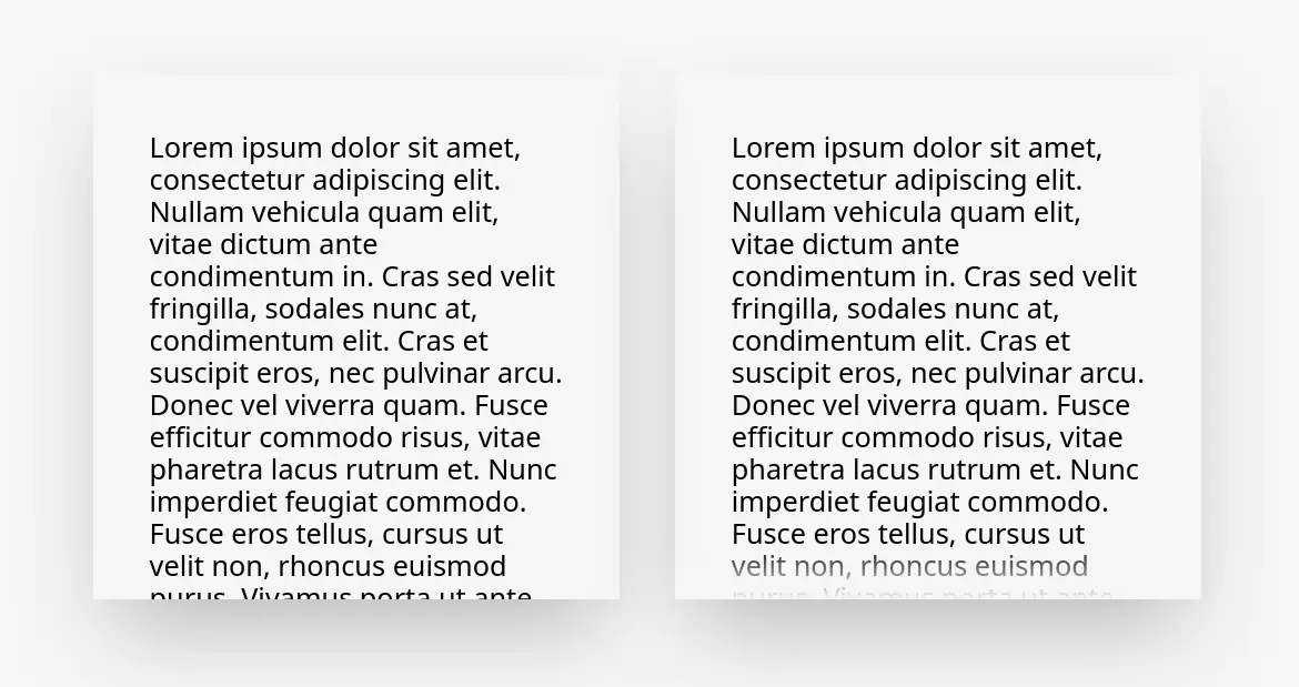
要讓捲軸元素的上下端都出現淡入淡出的特效一種作法是直接對元素添加 mask-image:CSS Div Fade Scroll Styling - stack overflow 真實的淡出淡入,不過這種作法依靠 JS 動態檢測並調整是否採用淡入樣式且語法較新穎。
#content {  overflow-y: auto;  -webkit-mask-image: linear-gradient(to bottom, transparent 0, black var(--top-mask-size, 0), black calc(100% - var(--bottom-mask-size, 0)), transparent 100%);  mask-image: linear-gradient(to bottom, transparent 0, black var(--top-mask-size, 0), black calc(100% - var(--bottom-mask-size, 0)), transparent 100%);  --top-mask-size: 0px;  --bottom-mask-size: 0px;}
#content.is-top-overflowing {  --top-mask-size: 48px !important;}
#content.is-bottom-overflowing {  --bottom-mask-size: 48px !important;}
function setClasses(el) { const isScrollable = el.scrollHeight > el.clientHeight;
// GUARD: If element is not scrollable, remove all classes if (!isScrollable) { el.classList.remove('is-bottom-overflowing', 'is-top-overflowing'); return; }
// Otherwise, the element is overflowing! // Now we just need to find out which direction it is overflowing to (can be both). // One pixel is added to the height to account for non-integer heights. const isScrolledToBottom = el.scrollHeight < el.clientHeight + el.scrollTop + 1; const isScrolledToTop = isScrolledToBottom ? false : el.scrollTop === 0; el.classList.toggle('is-bottom-overflowing', !isScrolledToBottom); el.classList.toggle('is-top-overflowing', !isScrolledToTop);}
document.querySelector('#content').addEventListener('scroll', (e) => { const el = e.currentTarget; setClasses(el);});
setClasses(document.querySelector('#content'));可以預期維護起來還蠻麻煩的,經驗也告訴我樣式問題就盡量透過現代 CSS 去解決,扯到 JS 很多時候會過度工程且產生更多問題(適用性、效能……)。
方法二、漸層偽元素遮蓋內容
其實「偵測內容是否觸及邊緣」是非必要的,只要「元素的留白大於漸變深度」那麼可以輕易創建偽元素將其定位於留白中,只要滑動到底自然會與留白重疊。
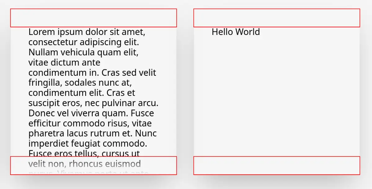
<div class="box-wrapper"> <div class="box"> Hello World </div></div>.box { padding: var(--box-padding); width: 300px; height: 300px; overflow: auto; color: black; box-shadow: 0 25px 50px -12px rgb(0 0 0 / 0.25);}
.box-wrapper { position: relative;}
.box-wrapper::before,.box-wrapper::after { content: ""; position: absolute; left: 0; width: 100%; height: var(--box-padding); z-index: 1; pointer-events: none;}
.box-wrapper::before { top: 0; background: linear-gradient(to bottom, var(--background), transparent);}
.box-wrapper::after { bottom: 0; background: linear-gradient(to top, var(--background), transparent);}總結
透過簡單的 CSS 偽元素創造出純粹裝飾用的元素,並透過 absolute 定位藏匿於留白當中可以優雅的避免透過複雜的 JS 實現樣式開關,這個樣式我應用於自己的線上履歷可以參考看看。