前言
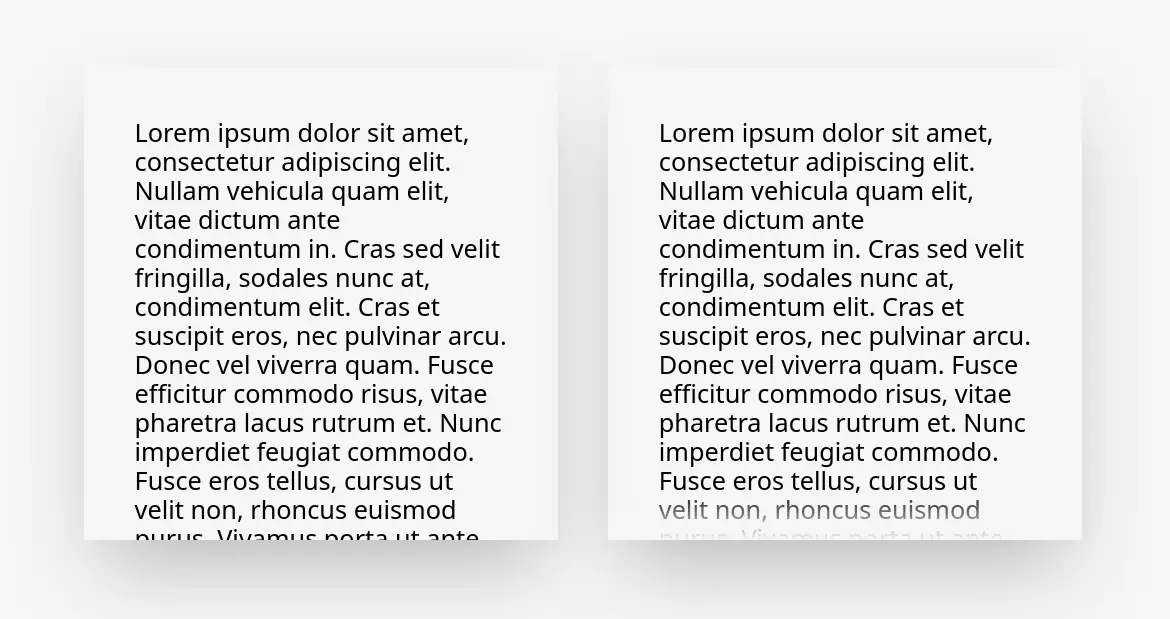
近期预览我的线上履历时发现阅读体验有点生硬,甚至最糟的情况下会裁到文字行间,导致没有任何提示指明可以继续往下滑动,可以参考 CodePen 实体范例。这篇文章描述如何通过 CSS 伪元素达成滚动元素淡入的样式。
实作
方法一、元素渐变遮罩
要让滚动元素的上下端都出现淡入淡出的特效一种作法是直接对元素添加 mask-image:CSS Div Fade Scroll Styling - stack overflow 真实的淡出淡入,不过这种作法依靠 JS 动态检测并调整是否采用淡入样式且语法较新颖。
#content {  overflow-y: auto;  -webkit-mask-image: linear-gradient(to bottom, transparent 0, black var(--top-mask-size, 0), black calc(100% - var(--bottom-mask-size, 0)), transparent 100%);  mask-image: linear-gradient(to bottom, transparent 0, black var(--top-mask-size, 0), black calc(100% - var(--bottom-mask-size, 0)), transparent 100%);  --top-mask-size: 0px;  --bottom-mask-size: 0px;}
#content.is-top-overflowing {  --top-mask-size: 48px !important;}
#content.is-bottom-overflowing {  --bottom-mask-size: 48px !important;}
function setClasses(el) { const isScrollable = el.scrollHeight > el.clientHeight;
// GUARD: If element is not scrollable, remove all classes if (!isScrollable) { el.classList.remove('is-bottom-overflowing', 'is-top-overflowing'); return; }
// Otherwise, the element is overflowing! // Now we just need to find out which direction it is overflowing to (can be both). // One pixel is added to the height to account for non-integer heights. const isScrolledToBottom = el.scrollHeight < el.clientHeight + el.scrollTop + 1; const isScrolledToTop = isScrolledToBottom ? false : el.scrollTop === 0; el.classList.toggle('is-bottom-overflowing', !isScrolledToBottom); el.classList.toggle('is-top-overflowing', !isScrolledToTop);}
document.querySelector('#content').addEventListener('scroll', (e) => { const el = e.currentTarget; setClasses(el);});
setClasses(document.querySelector('#content'));可以预期维护起来还蛮麻烦的,经验也告诉我样式问题就尽量通过现代 CSS 去解决,扯到 JS 很多时候会过度工程且产生更多问题(适用性、性能……)。
方法二、渐变伪元素遮盖内容
其实“检测内容是否触及边缘”是非必要的,只要“元素的留白大于渐变深度”那么可以轻易创建伪元素将其定位于留白中,只要滑动到底自然会与留白重叠。
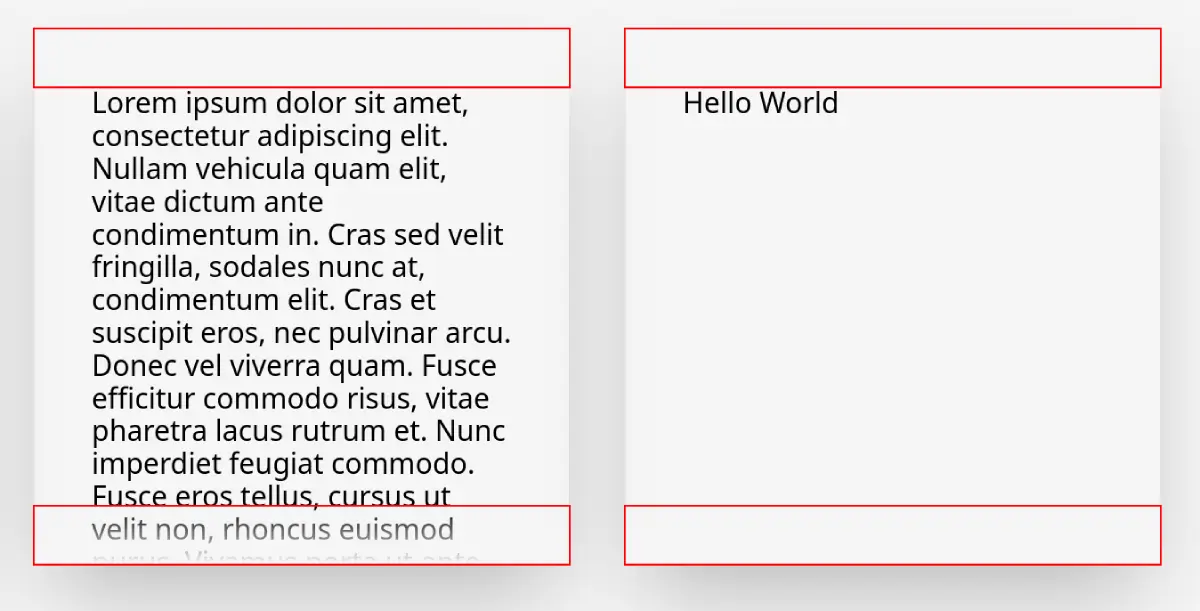
<div class="box-wrapper"> <div class="box"> Hello World </div></div>.box { padding: var(--box-padding); width: 300px; height: 300px; overflow: auto; color: black; box-shadow: 0 25px 50px -12px rgb(0 0 0 / 0.25);}
.box-wrapper { position: relative;}
.box-wrapper::before,.box-wrapper::after { content: ""; position: absolute; left: 0; width: 100%; height: var(--box-padding); z-index: 1; pointer-events: none;}
.box-wrapper::before { top: 0; background: linear-gradient(to bottom, var(--background), transparent);}
.box-wrapper::after { bottom: 0; background: linear-gradient(to top, var(--background), transparent);}总结
通过简单的 CSS 伪元素创造出纯粹装饰用的元素,并通过 absolute 定位藏匿于留白当中可以优雅的避免通过复杂的 JS 实现样式开关,这个样式我应用于自己的线上履历可以参考看看。