Introduction
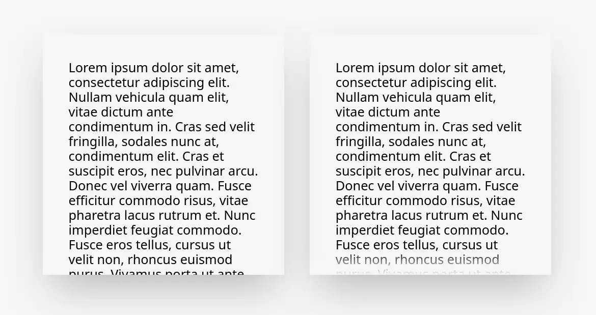
Recently, I found the reading experience of my online resume a bit off, and in the worst cases, the text was cut off, leading to no indication that scrolling down is possible. You can refer to the CodePen example. This article describes how to achieve a fade-in style for scrollable elements using CSS pseudo elements.
Implementation
Method 1: Gradient Mask
To create a fade-in and fade-out effect at the top and bottom of a scrollable element, one method is to add mask-image directly to the element: CSS Div Fade Scroll Styling - stack overflow. This achieves a true fade effect, but this method relies on JS to dynamically detect and adjust whether to apply the fade-in style and uses more modern syntax.
#content {  overflow-y: auto;  -webkit-mask-image: linear-gradient(to bottom, transparent 0, black var(--top-mask-size, 0), black calc(100% - var(--bottom-mask-size, 0)), transparent 100%);  mask-image: linear-gradient(to bottom, transparent 0, black var(--top-mask-size, 0), black calc(100% - var(--bottom-mask-size, 0)), transparent 100%);  --top-mask-size: 0px;  --bottom-mask-size: 0px;}
#content.is-top-overflowing {  --top-mask-size: 48px !important;}
#content.is-bottom-overflowing {  --bottom-mask-size: 48px !important;}
function setClasses(el) { const isScrollable = el.scrollHeight > el.clientHeight;
// GUARD: If element is not scrollable, remove all classes if (!isScrollable) { el.classList.remove('is-bottom-overflowing', 'is-top-overflowing'); return; }
// Otherwise, the element is overflowing! // Now we just need to find out which direction it is overflowing to (can be both). // One pixel is added to the height to account for non-integer heights. const isScrolledToBottom = el.scrollHeight < el.clientHeight + el.scrollTop + 1; const isScrolledToTop = isScrolledToBottom ? false : el.scrollTop === 0; el.classList.toggle('is-bottom-overflowing', !isScrolledToBottom); el.classList.toggle('is-top-overflowing', !isScrolledToTop);}
document.querySelector('#content').addEventListener('scroll', (e) => { const el = e.currentTarget; setClasses(el);});
setClasses(document.querySelector('#content'));It can be expected that maintenance can be quite troublesome. Experience also tells me that styling issues should ideally be solved through modern CSS, as involving JS often leads to overengineering and more problems (compatibility, performance, etc.).
Method 2: Gradient Pseudo Elements Covering Content
In fact, “detecting whether the content touches the edges” is not necessary. As long as “the element’s padding is greater than the gradient size,” it is easy to create pseudo elements positioned inside the padding, which will naturally overlap when scrolled to the bottom or top.
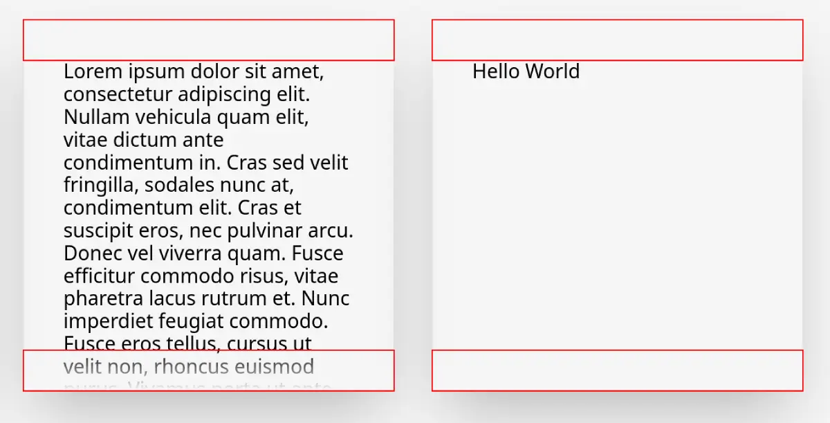
<div class="box-wrapper"> <div class="box"> Hello World </div></div>.box { padding: var(--box-padding); width: 300px; height: 300px; overflow: auto; color: black; box-shadow: 0 25px 50px -12px rgb(0 0 0 / 0.25);}
.box-wrapper { position: relative;}
.box-wrapper::before,.box-wrapper::after { content: ""; position: absolute; left: 0; width: 100%; height: var(--box-padding); z-index: 1; pointer-events: none;}
.box-wrapper::before { top: 0; background: linear-gradient(to bottom, var(--background), transparent);}
.box-wrapper::after { bottom: 0; background: linear-gradient(to top, var(--background), transparent);}Conclusion
By using simple CSS pseudo elements to create purely decorative elements and positioning them using absolute within the padding, we can elegantly avoid implementing it through complex JS. I applied this effect in my online resume for reference.