Build Dark Mode (or Any Website Style) the Right Way
Introduction
As previously mentioned in “The Cost of Adding Dark Mode”, adding dark mode inevitably needs additional design, development, and maintenance costs. However, if the right approach is taken from the beginning to create website styles, many issues can be effectively avoided.
Implementing Dark Mode (Color Styles)
Dark mode can be viewed as a color style primarily based on darker tones. Creating dark mode is essentially about producing different color theme for the website. So how can we create a color system that is flexible and easy to maintain?
Method 1: Allow Styles to Have Different Colors
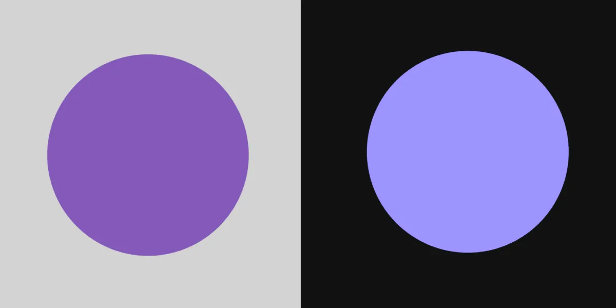
You can define color values as variables and reference them in different places, for example: #534af7. Dark mode can be seen as a theme, where colors need to change under specific theme conditions. For instance, color A might change to color B in dark mode, and you can further establish relationships between colors through naming.
First, define the colors:
primary: #534af7primary-dark: #b887f7.
Then, define the logic:
:root {  --primary: #534af7;  --primary-dark: #b887f7;}
/* Text uses primary color */body {  color: var(--primary);}
/* When body is in dark style, text uses primary-dark color */body.dark {  color: var(--primary-dark);}
Alternatively, as a designer, you might need to create two sets of design drafts with the same content but assigned different colors:
Clearly, this approach is not ideal; it means that for every new style, the workload will at least double. Unless there are special circumstances requiring specific colors, it’s best not to manage colors this way. If you are using Tailwind’s Dark Mode feature, be aware that such issues may arise.
Method 2: Allow Colors to Have Different Style Characteristics
From the previous example, we can see that while there is high flexibility, the relationships between colors are defined by the referencing conditions. These scattered logics across different pages will be difficult to manage and unify.
However, if we specify that the same color has different style characteristics, the relationships between colors can become tighter, making color management and style expansion easier.
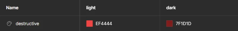
/* The logic of primary color can have different interpretations in different contexts */:root {  --primary: #534af7;}
:root .dark {  --primary: #b887f7;}
/* Body text uses primary color */body {  color: var(--primary);}
Modern UI design software typically has features to define different styles for the same color. For example, Figma allows for variable definitions in different contexts through the Design Token feature, enabling designers to switch between different styles, including but not limited to colors, with ease.
The video above comes from the Update 1: Tokens, variables, and styles official Figma documentation, which describes how to create different style definitions for the same color and switch easily.
Summary
Most of the time, creating color styles should start with defining different styles for colors. It is rare to need to write the logic for defining colors in individual UIs; unified management is usually the “most correct” approach.