Must to Know About Web Accessibility
Introduction
I recently watched The Only Accessibility Video You Will Ever Need from Web Dev Simplified, which prompted me to start this article to document its key web accessibility considerations, along with some useful insights from my own experiments.
Accessibility is something I have always wanted to prioritize, yet it consistently ends up last during development. Poor accessibility can severely affect how some users interact with a website. As frontend developers, maintaining good web accessibility is a fundamental responsibility.
What Is Web Accessibility?
Web accessibility follows the same principle as accessibility in physical spaces: an accessible website accommodates people with different physical abilities and usage environments. For example, people with visual impairments or those using a keyboard may need appropriate visual treatments or additional accessibility information to ensure they can understand and interact with the site. I have explored some related topics before:
- Why Does Pressing Tab in the Browser Show a Blue Outline? - Focus Indicators
- Curious What Websites Look Like to People with Different Types of Color Blindness?
Does that make web accessibility a set of special accommodations for a small minority of users? Not entirely.
Age-related changes, difficult environments, limited hardware, personal preferences, and other factors all come into play. Ultimately, web accessibility is about creating an inclusive experience that ensures everyone can use websites equally and smoothly. As frontend developers, maintaining good accessibility—an inclusive user experience—is an ideal to work toward, and for some websites, it is a requirement.
What Is ARIA?
ARIA is a collection of HTML attributes used to add accessibility information to webpage elements, such as aria-label, aria-live, and others, helping improve the experience for people using assistive technologies.
Semantic HTML already provides accessibility benefits, and building pages with modern HTML also gives users more information. Before investing effort in adding ARIA attributes, developers should first ensure that the page has a solid semantic structure. ARIA support can vary by operating system, browser, or assistive software version. Semantic HTML, however, is a foundational standard that provides more information to web crawlers, assistive technologies, and browsers to improve the experience, so it should take priority.
Browser Accessibility Inspection Tools
Modern browsers offer various tools for inspecting a page’s accessibility information. In addition to the familiar Elements panel, I recommend opening the Accessibility panel to inspect the accessibility of elements on the page. In Chrome, for example, try the following:
- Press
F12to open the browser DevTools - Press
Ctrl + Shift + Por⌘ + Shift + Pand enter the command Show Accessibility - Under
Accessibility Tree> Check Enable full-page accessibility tree

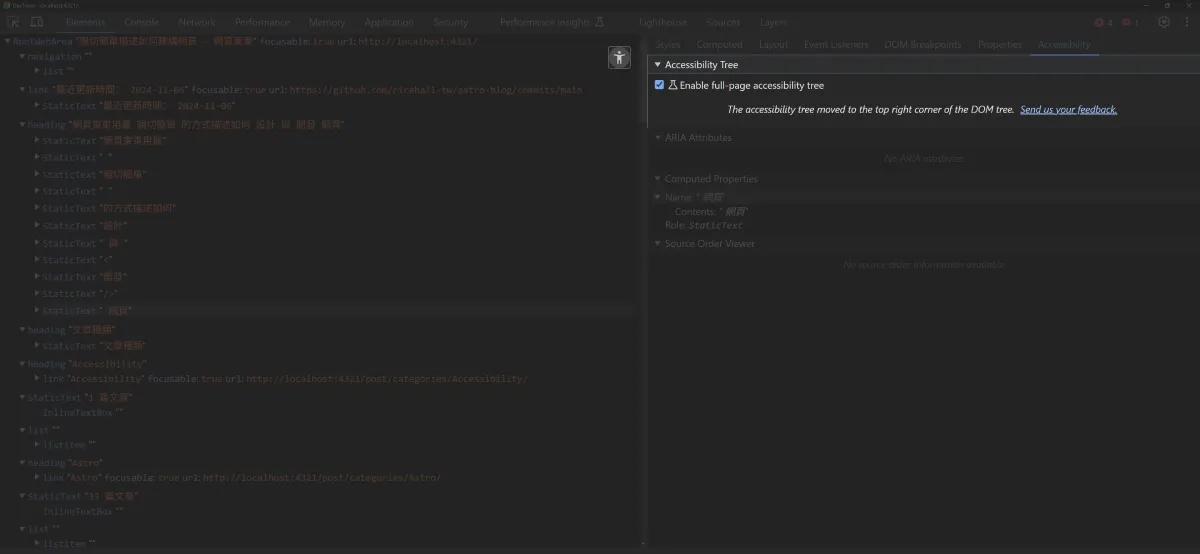
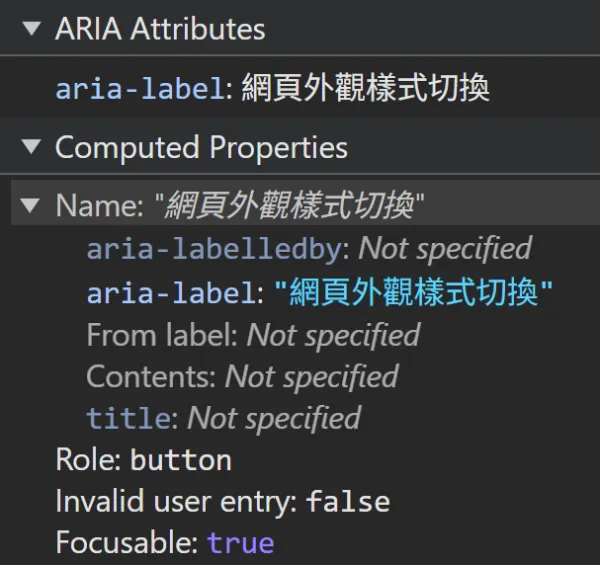
The Accessibility panel works much like the familiar element inspector: select and click an element to see its details in the sidebar. The screenshot below shows an element’s accessibility-related attributes and information, which is very helpful for understanding the additional accessibility information a page conveys:
Visual Accessibility
Clearly Communicate Page Content
Text, images, and videos should all clearly communicate their purpose. When building websites, we often underestimate how much we rely on our own understanding of the context, leaving users unsure what page elements do.
For example, we often do not need to display all the available information at once. Instead, we create a button labeled “Show more” to tell users, “If you are interested, click here for more related information.”
The problem is that “more” is vague. Crawlers—bots that visit websites—do not know what “more” means. People using screen readers do not know what “more” means. Poor UI can leave other users equally confused. Relying on context to explain an action can easily cause confusion and misunderstanding. So instead of simply asking users to “Read more” or whether they are “Sure,” clearly explain what an action will do. This is a fundamental way to improve both usability and accessibility.
Another potential issue is neglecting to provide or write alternative text with the alt attribute for images, or captions for videos. Setting videos aside for now, since they are less common, the “Google Search Central recommendations” for image alt text are practical and clear!
Color Contrast
Strict pass/fail judgments based on color contrast are not useful as guidance and do not necessarily address the needs of individual users. In fact, when it comes to contrast, different users have conflicting needs—what benefits some may harm others. This even applies to font size. - APCA in a Nutshell🔗
I previously explored what websites look like to people with different types of color blindness. Third-party websites such as Colorblind Web Page Filter can simulate how a page appears to people with visual impairments.
Chrome’s built-in color picker also includes color accessibility checks, assigning AA or AAA ratings based on an element’s size and color contrast. These are different levels of accessibility requirements defined by the WCAG, allowing website developers to choose an appropriate level for their needs and improve usability.
Keep in mind that WCAG 2.x contrast calculations do not always align with human visual perception in certain color combinations. Still, it remains a common industry standard. You can also explore how the APCA algorithm addresses the shortcomings of WCAG color contrast evaluation.
APCA may eventually become the official color contrast standard in WCAG3. In the meantime, if you want a transitional solution, consider Bridge-PCA, which is 100% compatible with WCAG2 contrast requirements.
- Are You Still Using WCAG2? UI Contrast Visibility Standards| WCAG2 Are You Still Using It? UI Contrast Visibility Standard (Readability Contrast)
- Why color contrast is not as black and white as it seems
Focus Indicators
See my earlier article: Why Does Pressing Tab in the Browser Show a Blue Outline?
aria-label
When an element lacks clear text or imagery, aria-label provides a text alternative for assistive technologies, improving the user experience. For example:
- Icon-only elements: For elements that contain only an icon and have no text description, such as icon buttons,
aria-labelcan explain their purpose. - Additional explanation: When an element’s purpose is unclear,
aria-labelcan help prevent misunderstandings.
Suppose a search button uses a magnifying glass icon but has no text description. You can use aria-label as follows:
<button aria-label="Search"> <svg><!-- ... --></svg></button>Keep aria-label text concise and clear so users can quickly understand the element’s function, and avoid repetition. If an element already has a visible description, such as text on a button, an additional aria-label is usually unnecessary and may be redundant.
aria-labelby
Unlike aria-label, aria-labelledby does not supply descriptive text directly. Instead, it references other elements on the same page and uses their content as the element’s description. This is especially useful when multiple elements are needed to provide a description. For example:
- Multiple descriptions: When an element needs descriptions from multiple elements,
aria-labelledbycan reference multiple labeling elements. - Shared descriptions: Form fields, for example, may need the same heading or instructions. With
aria-labelledby, they can reference the same element. - Improved readability: Referencing headings or descriptions in tables or lists lets assistive technologies present contextual information more naturally.
Suppose an input field has a label and instructions:
<label id="nameLabel">Name</label><span id="nameDescription">Please enter your full name.</span><input type="text" aria-labelledby="nameLabel nameDescription" />Assistive technologies will read both the label “Name” and the instructions “Please enter your full name,” helping users clearly understand the field’s purpose and requirements. As another example, suppose there is a group of buttons, and the group’s heading can describe each button:
<h2 id="socialMediaOptions">Choose your social media platform</h2><button aria-labelledby="socialMediaOptions">Facebook</button><button aria-labelledby="socialMediaOptions">X</button><button aria-labelledby="socialMediaOptions">Instagram</button>Each button will first announce “Choose your social media platform,” followed by its own content, such as “Facebook,” providing better context for each button.
Also, avoid using aria-labelledby together with aria-label to prevent confusing descriptions. Referenced elements should contain descriptive text so they can provide complete, clear information to assistive technologies.
aria-live
This specifies how assistive technologies should be notified when an element’s content changes, ensuring users do not miss important updates on the page. For example:
off: The default value. Content changes do not trigger notifications to assistive technologies. Suitable for nonessential content updates.polite: Content changes notify assistive technologies, but updates are announced only after the user finishes the current activity, such as reading. Suitable for updates that require attention without interrupting the user.assertive: Content changes immediately interrupt the user’s current activity and notify assistive technologies of the updated content. Suitable for important, urgent notifications, such as error messages or critical alerts.
Suppose a form displays a success or failure message after submission. You can use aria-live to notify users of assistive technologies:
<div aria-live="assertive" id="statusMessage"> <!-- The submission result message will appear here --></div>When the content of this <div> is updated after form submission, assistive technologies will immediately read the updated message aloud. aria-live can improve the accessibility of dynamic pages, especially for content that requires real-time updates or notifications.
Keyboard Accessibility
tabindex
Keyboard users typically press Tab to move focus between elements on a page. Many elements, such as <a>, <button>, and <input>, are focusable by default without any additional attributes. Browsers also typically apply a default focus indicator to the focused element, which explains why pressing Tab in the browser shows a blue outline.
tabindex lets you control whether an element can receive focus and its position in the focus order.
tabindex="0": The element can receive keyboard focus and participates in the tab order according to its position in the DOM.tabindex="-1": The element cannot receive keyboard focus unless JavaScript explicitly focuses it. For example, a hidden popup can have tabindex=“-1” so it can receive focus automatically when opened.- Positive integers, such as
tabindex="1": These place the element at a specified position in the focus order, before elements withtabindex="0". Elements withtabindex="1"receive focus first, followed by those withtabindex="2", and so on.
<a href="#section1" tabindex="1">Section 1</a><a href="#section2" tabindex="3">Section 2</a><a href="#section3" tabindex="2">Section 3</a><button tabindex="0">Default Focus Button</button>
<!-- In the example above, pressing Tab moves focus in this order: Section 1 → Section 3 → Section 2 → Default Focus Button. -->- Avoid values greater than
tabindex="0": Assigning positivetabindexvalues makes the focus order complicated and difficult to maintain. - Use
tabindex="0"to make specific elements focusable: Custom buttons or cards, for example, can usetabindex="0"to follow the natural DOM focus order. - Use
tabindex="-1"where appropriate to exclude unnecessary elements: If you do not want certain elements, such as hidden popups, to receive keyboard focus, usetabindex="-1". When these elements appear, focus them explicitly with JavaScript.
How to Automate Accessibility Checks
Frontend development involves many considerations around SEO, usability, and best practices. To understand how users or crawlers interpret your pages, try Google’s auditing tool: Lighthouse.
In addition to the version built into Chrome, you can run audits through PageSpeed Insights. If you want to integrate audits into your project’s CI pipeline, see my earlier article: Automating Website Performance Audits with Lighthouse CI
Further Reading
- Do Not Tell Users to “Read More” - WebDong.
- Building Products for Everyone: What Is Accessibility? - A11y Village
- Customizing the Accessibility Tree Starts with Understanding ARIA (Part 1) - A11y Village
- Learn Accessibility - web.dev
- ARIA Authoring Practices Guide (APG) - W3C
- Overlooked HTML: Accessibility - Just lepture