How to Manage Digital Product Variables
Introduction
Recent projects have involved a complete visual design overhaul, leading to the frontend facing the challenge of how to synchronize the management of product visuals. The tools used are Figma for design and Tailwind as the utility-first CSS framework, but these are just tools; the main topic is more abstract: how can digital products manage variables in the UI.
To start with the pain points, previous projects lacked specific guidelines on how to define values within the UI, resulting in magic numbers (values without specifications or descriptions) running throughout the product, causing significant issues.
I will explain as clearly as possible how to manage values when redesigning a digital product; these ideas are largely inspired by Figma’s documentation on Design Tokens.
What are UI Variables
UI variables are variables that exist in the user interface. Some refer to them as design tokens, while others call them variables. In any case, it is a name pointing to a value, and you can imagine it as a box containing a certain value used in the UI.
There are many types of UI values, which can represent colors, sizes, corner radius, opacity, effect scales, etc. Specific examples include:
gray-500=#333spacing-1=4pxopacity-50=50%
Different environments may have variations, and usually, variables can also point to another variable, for example:
primary-500=gray-500
How to Manage UI Variables
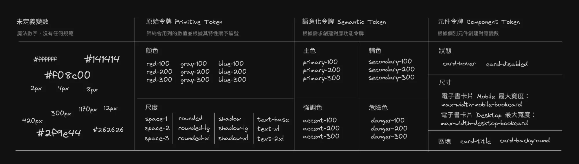
You have likely used the concept of variables to manage values to some extent, but without specific naming or rules. Therefore, the first step is to identify the patterns in the values and give them a unified and clear name. The following explanation will use colors as the main case.
Step One: Primitive Variable
Purpose: Achieve globally usable and manageable “values”
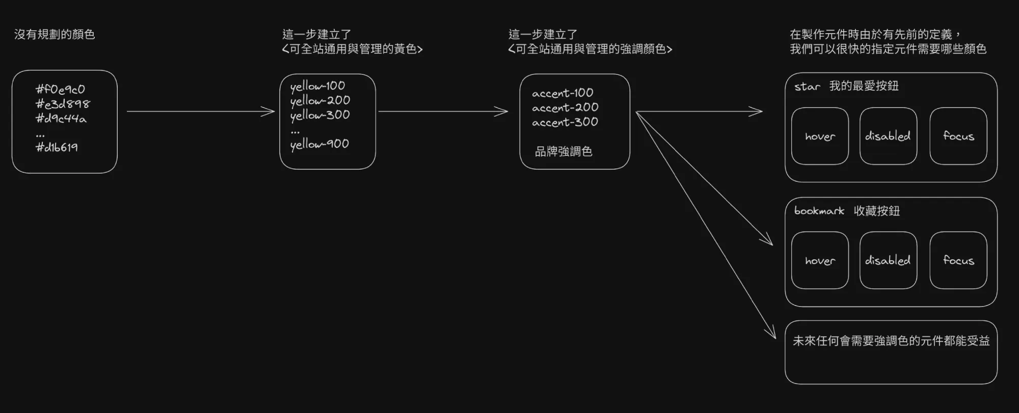
Since it is called a primitive value, the naming at this stage should straightforwardly describe the “value” itself, for example: it is yellow, green, magenta, and the lightness relationship with other colors is at thirty percent. In the future, the entire system will only need this one color to avoid confusion: yellow-300.
By establishing a series of variables to represent a certain range of colors:
yellow-100=#fef9c3yellow-200=#fef08a- …
yellow-1000=#713f12
This way, the entire product’s “yellow” can be clearly defined in terms of its range and hierarchy, rather than having colors scattered and disordered everywhere. You can define prefixes or the number of variables according to your preferences, but the key is consistency.
Step Two: Semantic Variable
Purpose: Achieve globally usable and manageable “meanings”
Semantic means that at this stage, a specific meaning should be assigned to the value. For example, the previously mentioned yellow series colors themselves do not have specific meanings and can be used anywhere, which may lead to specific colors being tied to meanings. In medium to large systems, we inevitably need to extract and manage repeated patterns, for example:
accent-100=yellow-100accent-200=yellow-200accent-1000=yellow-1000
This creates a color with meaning: accent (emphasis color). In the future, whenever there is a need for an emphasized color in the product, since a complete set of ready-to-use emphasis colors has already been defined, any UI that requires an emphasized color can benefit, enhancing design consistency and maintainability.
At the same time, creating semantic variables allows for the dynamic replacement of the values behind specific semantic variables. The best example is dark mode, for example…
- Future emphasis colors need to be fine-tuned; just re-pointing to semantic values can solve it all at once. (I don’t like the emphasis color to be yellow, so I changed it to red.)
- To create different style systems, just re-pointing to semantic values can solve it all at once. (I want to create a dark style interface, so I changed it to the original values of the dark series.)
When a certain meaning is repeatedly used in the UI, it indicates that you should try to abstract it into semantic variables. This not only facilitates future maintenance but also allows you to start from an agreed-upon foundation when drawing a brand new UI. You can refer to what semantic variables mature design systems typically have, such as: primary, secondary, success, warning, danger, info.
Step 3: Component Variable
Today’s UI somewhat possesses a certain nature of repeatable extensibility, just like building blocks, and component variables are semantic variables created for the values of these components, such as button-hover, button-active, button-disabled. Defining these component variables is like creating a replaceable interface for the components, allowing different values to be assigned to component variables to achieve the same component but with different appearances. For example…
- The same component but across different products, since each product corresponds to different brand colors, you can achieve the same component but with different product brand appearances by assigning colors to pre-defined component variables.
- Defining component variables will force us to think about the relationship of components to the outside, requiring that the descriptions of public interfaces must be clear.
Summary
The above describes the general concept of how to manage UI variables in the most concrete way.
In practice, you can set details according to your preferences, such as unifying common component interface names, naming conventions for semantic variables, the gradation of raw values, etc. The key is to ensure that the entire system has consistency and maintainability.