Introduction
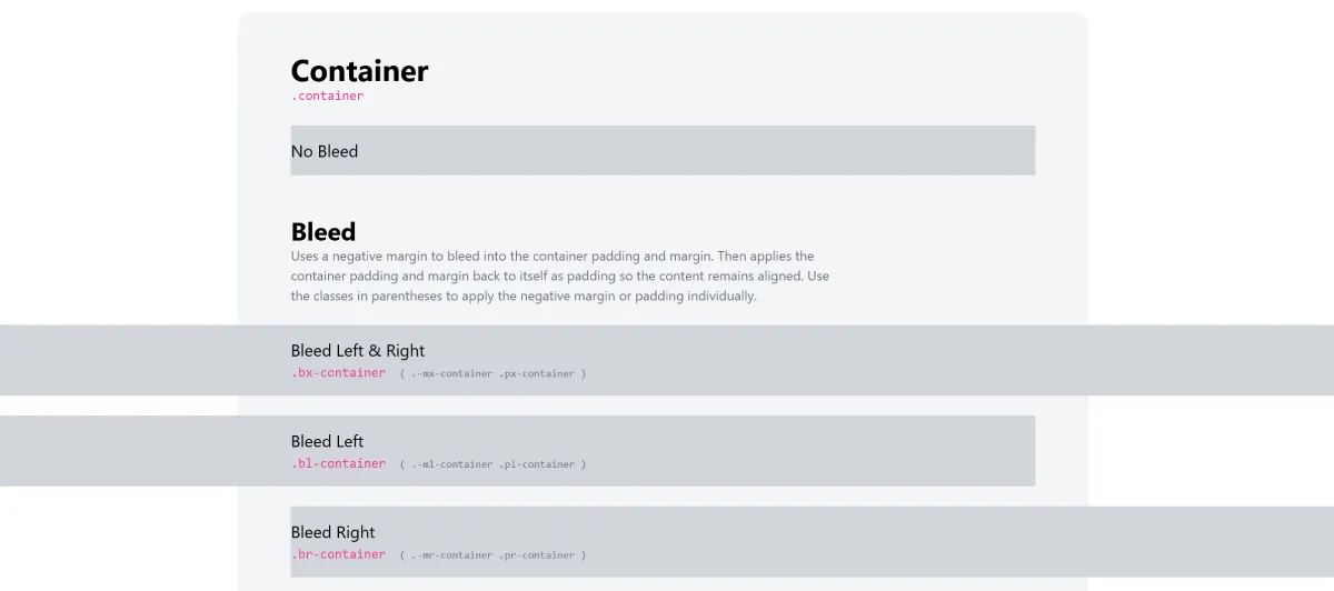
Recently, I’m rebuilding some unique pages found out that specifically like those shown on the Tailwind CSS Container Bleed Plugin page. To ensure that page content remains within reasonable limits, a fixed-size outer container is often needed (refer to the No Bleed example in the image below):
Such a container can be easily implemented on the parent element with just a few lines of CSS:
.container { max-width: 1200px; margin-left: auto; margin-right: auto;}However, if you want the content to break out of the container’s boundaries, it can become a bit tricky. Here, I reference Kevin Powell’s video that specifically introduces this layout method: How to escape the container on only one side.
Exploring CSS Grid for Achieving Bleed Layout
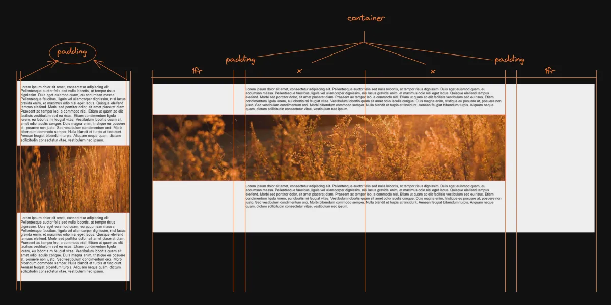
This issue becomes much easier with the help of CSS Grid. First, imagine that on mobile, there isn’t much difference from traditional fixed-size layouts. For more complex large sizes, we can set breakpoints at specific sizes to require the entire container to divide the content into 4 equal parts (or any division you prefer):
@media (min-width: 1200px) { .full-container { display: grid; grid-template-columns: minmax(var(--container-padding-inline), 1fr) minmax(0, var(--max-container-width-half)) minmax(0, var(--max-container-width-half)) minmax(var(--container-padding-inline), 1fr); }}Here, we use a special CSS function minmax() to achieve the desired behavior. This function constrains the minimum and maximum values, allowing us to maintain minimum spacing on both sides while using the grid’s fr unit to fill the remaining space as much as possible.
After achieving the container layout, the next step is to assign positions for the content. Here, I wrote a .bleed class to facilitate any elements that want to break out of the container:
/* Specify padding and address in Grid for non-bleed elements within the container */.full-container > :not(.bleed) { padding-inline: var(--container-padding-inline); grid-column: 2 /4;}/* Specify the address in Grid for bleed elements */.full-container > .bleed { grid-column: 1 / 4;}During the process, it is encouraged to store all CSS values using CSS variables, otherwise it will be a headache to maintain the unnamed magic numbers 😅.
Finally, here is a 1200px container with bleed on the edge: CodePen link. Practice always helps you understand things the fastest, so give it a try.