Introduction
Recently, the company purchased design-related courses to improve collaboration efficiency through design research. My previous work was also related to design, and I have long wanted to write more articles related to web development across fields! Therefore, I plan to start a series of articles to document my course notes and my own thoughts and resources.
Choosing Color Space
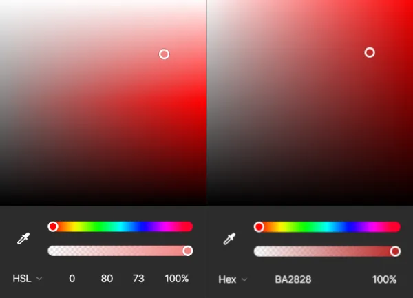
Current mainstream color screens rely on RGB color model to display various colors through mixed light. However, using color spaces that are closer to human intuition helps in color selection, such as HSL (Hue, Saturation, Lightness).
- Hue: The type of color
- Saturation: The intensity of the color
- Lightness: The brightness of the color
Compared to seeing RGB presented as three numbers like RGB(222, 55, 55), it is more common to see color codes displayed in HEX format like: #de3737. This is actually a hexadecimal representation of RGB, where every two characters represent a color. They are the same thing but recorded in different ways for different color channels.
| Description | Hex | Value |
|---|---|---|
| Red | de | 222 |
| Green | 37 | 55 |
| Blue | 37 | 55 |
Due to hardware display limitations, the basic mainstream for developing digital products uses the RGB color space. However, it is also okay to convert from other color spaces as long as the entire team has a consensus for unified management.
Choosing Colors
Choosing colors involves various theories. Here, I researched the design systems or methods of major companies (Apple, Adobe, Google) and summarized several principles to pay attention to.
60/30/10 Color Ratio Rule
Movies, Design, Painting…… User interface design and these visually related fields each have their own insights on color, but the most widely applicable rule is the 60:30:10 color ratio rule, which refers to the primary color, secondary color, and accent color.
- Primary Color: Creates the overall atmosphere
- Secondary Color: Supports the primary color
- Accent Color: Highlights the most important content in the scene
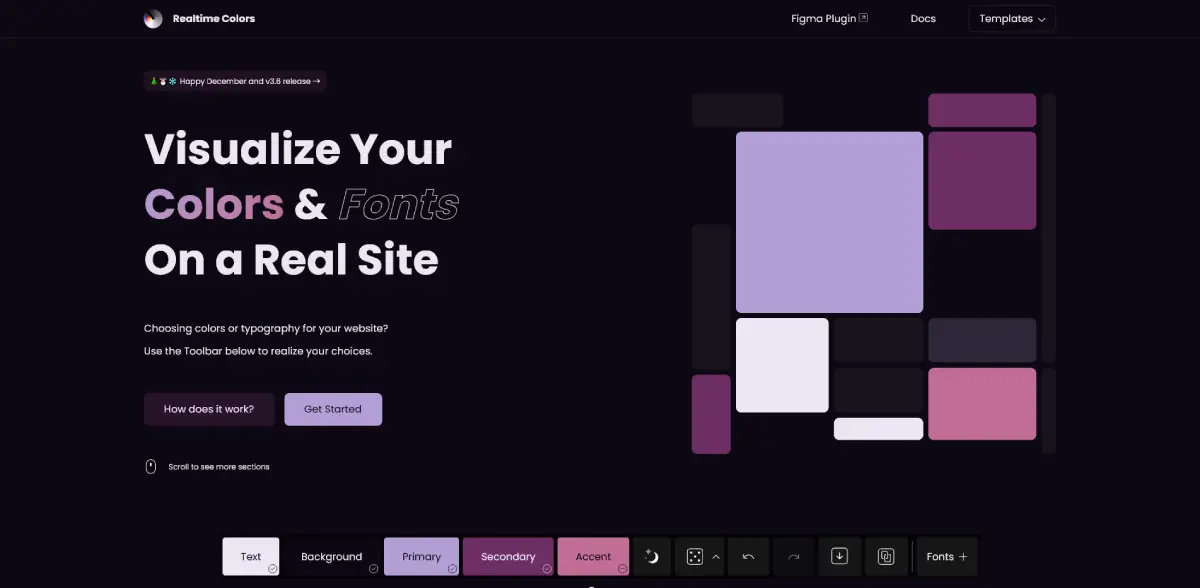
Especially for UI products, I particularly like Juxtoposed created Realtime Colors, which produced two videos describing the process of a UI designer going crazy dealing with colors, and how to create a mockup website product based on the 60/30/10 color ratio rule.
There are also some tools that can help us quickly generate color scales based on different color matching principles (analogous, monochromatic, triadic, complementary, etc.), allowing us to allocate the relationship between colors according to brand tone:
- Adobe Color - Adobe
- The super fast color palettes generator - coolors
Saturation Affects Brightness - Helmholtz-Kohlrausch Effect
According to Adobe Spectrum, as saturation increases, people’s perception of color brightness also changes. Therefore, it is crucial to pay attention to the impact of saturation on brightness. However, individuals who are color insensitive (color blind, color weak) may be affected to varying degrees. Thus, for accessibility considerations in design, it is essential to be aware of whether saturation affects the designer’s judgment of brightness.
Compared to determining the accessibility of colors with the naked eye, relying on recognized color validation standards such as APCA and WCAG ensures that colors can be interpreted by various groups.
Stevens’ Power Law
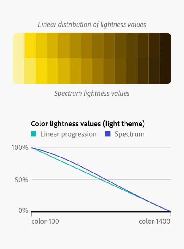
The non-linearity of human brightness perception leads to uneven brightness steps. Therefore, the Adobe Spectrum color scale system adjusts for this law, following an average of perceptual color scales.
Chromatic Adaptation
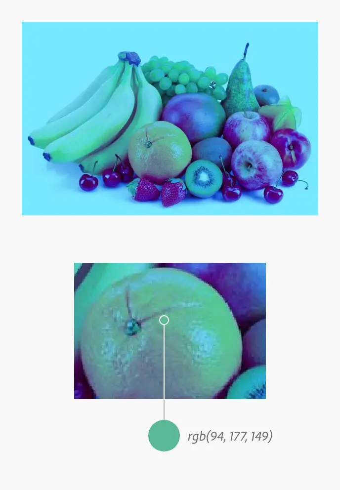
Humans compensate for colors based on their environment. For example, the brain will tone down the pink and orange hues present in evening light to recognize the true colors of objects in the visual field. This is known as color adaptation (also referred to as color constancy).
In the example image, the arrangement of fruits appears under a blue light source. Most of the local colors of the fruits seem intact, and the orange looks orange. But upon closer inspection, the actual color of the orange is green. Due to color adaptation in the blue environment, these greens appear orange.
Adobe Spectrum uses “completely desaturated gray to prevent color misinterpretation caused by user interface-induced color adaptation,” which I find quite special, as in painting, one tends to avoid purely unnatural “colorless gray” and pure gray is rarely found in nature. However, in UI design, they take the opposite approach to keep grayscale color neutral.
Choosing Color Scales
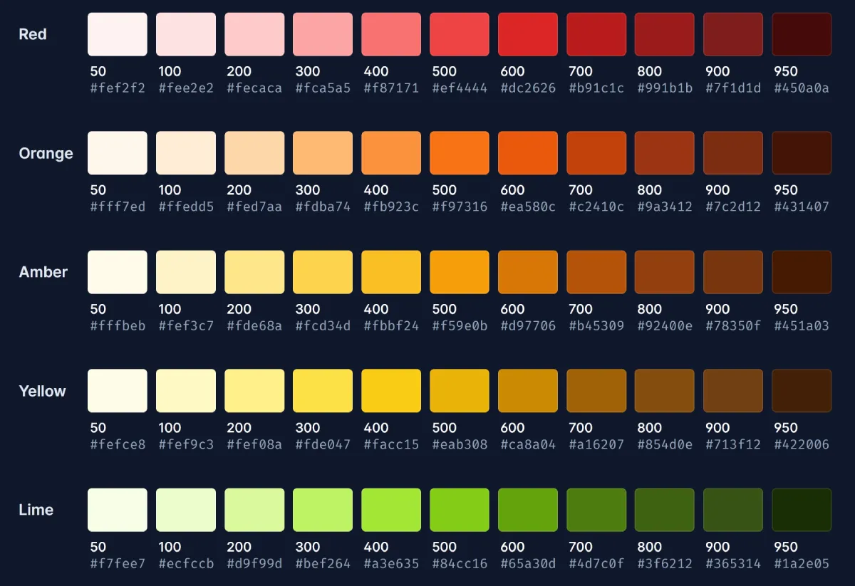
Using only one hue not only feels monotonous but also leaves users unaware of the importance of information layers. However, randomly adding colors to the interface can lead to maintenance difficulties and inconsistencies. Therefore, color scales are predefined options that give colors different layers and meanings. Here are some tools that can help us quickly generate color scales:
- Scale - color scale generator
- Tailwind CSS Color Generator - uicolors
The number of color scales does not have an absolute correct answer, but I personally believe starting with 10 is just right. This is because people can intuitively understand color scales from 0 to 10, which facilitates communication. Alternatively, you can ask your current team if there are existing style libraries or standards to adopt directly to save the cost of switching habits, for example: Tailwind’s built-in styles.
Color Naming
After researching, there are three color naming patterns within design systems that can meet most needs:
- Global Colors: Basic colors, usually named in the format of
color-scale. - Global Semantic Colors: Global colors that are assigned meanings.
- Component Colors: Colors that are assigned meanings and are used within components.
What is the significance of “Global Semantic Colors” or “Component Colors”?
If all colors are named according to color-name-scale, such as yellow-300 or green-400, this approach is only feasible when the design components are not too complex. As complexity increases, it is appropriate to abstract the meaning of colors and categorize them.
- Semantic Colors as an Example:
- Currently, all designs use global colors, but what if the overall style needs to be adjusted? For example, if the brand color changes from blue to purple, it would require redefining every instance where the related colors are used. Therefore, predefining some semantic colors facilitates smoother maintenance and modification in the future, such as creating a new
primary“global semantic” color for the main color tone, making future changes much easier.
- Currently, all designs use global colors, but what if the overall style needs to be adjusted? For example, if the brand color changes from blue to purple, it would require redefining every instance where the related colors are used. Therefore, predefining some semantic colors facilitates smoother maintenance and modification in the future, such as creating a new
- Component Colors as an Example:
- The concept is similar to semantic colors, but the scope is limited to components.
- If a component has many “color states,” consider creating component colors for unified management. For example, if a component uses many of the same global colors, changing them in the future will require selecting and adjusting each one individually, so component colors can be packaged.
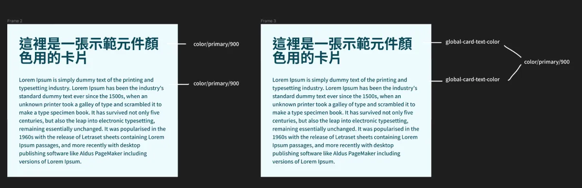
- Another usage scenario is when you find that the colors within a component do not need to exist in the system but are still required in the component, possibly because the color is dynamically generated or determined. In this case, you can also define component color definitions (e.g., background color generated based on an image). The final suggestion is not to overthink it; start with global colors.
Universal colors can be named using hue name-scale as the most basic usable colors.
Naming by Role
Using “role” as the name for colors, such as primary, error, success, is intended to tightly link colors with their purposes. This avoids situations where color adjustments do not align with their meanings. For example, if the brand’s primary color is named blue-xxx, what if it needs to be changed to purple in the future? To avoid disconnecting color meanings, it is best to name colors based on their roles and purposes.
Color Style Patterns
With the customization and personalization of UI and considering the needs of various groups (color blindness, color weakness), for example:
- Apple guidelines agree that in specific scenarios, using dark style interfaces is beneficial, such as using a dark interface in a deeply immersive video preview context to help people focus on the content
- Figma’s newly launched variable feature particularly enhances color variables to have “multiple states”, allowing the same color variable to be used in dark mode, which benefits color switching based on mode states.
- CSS has introduced the “prefers-contrast mode”.
Managing Colors
The current team is also considering how to synchronize colors between products or departments, such as Figma Variable and Tokens Studio.
Do Not Create Custom Colors
Any color should be standardized before use to ensure consistency across different products and teams.
Do Not Use Color as the Sole Means of Communication
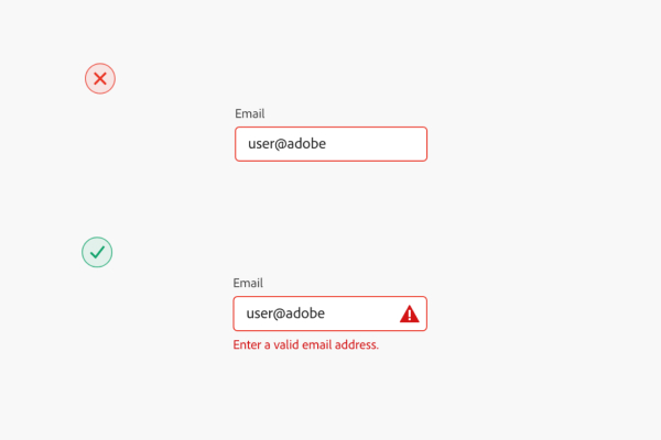
Color is a visual means of communication, but it should not be the only method relied upon. Please add additional text or icons to ensure understanding across different groups.
Do Not Use Opacity Just to Present Specific Colors
Opacity and color serve two completely different purposes. Adjusting opacity to display a specific color is no different from creating custom colors. Use opacity only for specific purposes, such as shadows, background overlays, and highlights.
Summary
Color is a broad topic. Exploring different design system teams’ views and standards on color reveals many interesting insights. As discussions and evolution with my team continue, I hope this article will be updated further.
Further Reading
- Spectrum - Adobe
- Color System - Material Design 3
- Color and Typography - Design system hands-on live series
- The difference between variables and styles - Figma