All You Need To Know About Optimal Images!
Introduction
Images and videos are the heaviest elements in data transmission on most websites. Understanding how to improve them is the most cost-effective choice.
If there are issues with website performance or loading speed, the first step can start with images or videos. Let’s begin with simple examples to identify potential problems step by step and how to solve them, as there are many interesting details about images that can be improved.
General Principles for Good Images
Here are some general principles for providing good images for websites, focusing more on overall ideas rather than syntax writing suggestions.
Appropriate Size
If a large image is displayed on a small screen, no matter how detailed the image is, it cannot clearly present the details (unless zoomed in). Therefore, provide images that are as large as the display can show to achieve the goal of saving computational and transmission resources.
Designers may not always pay attention to this point, so as front-end engineers, it is necessary to communicate with designers to ensure they provide suitable images for web use. Engineers can also learn basic image processing in graphic software to produce materials of the required size themselves or find online tools for image compression and cropping.
The appropriate image size will vary under different “Device Resolutions” and “Pixel Densities.”
Appropriate Format
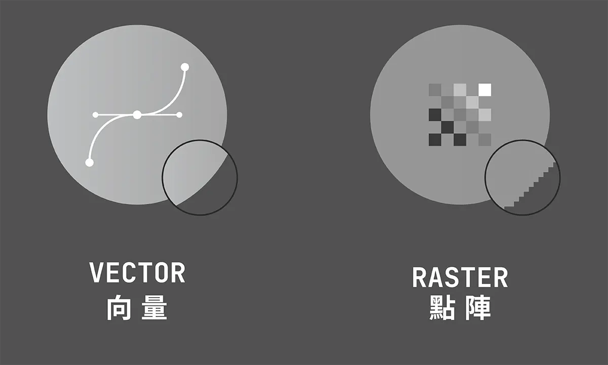
Different image formats have different characteristics and limitations. First, consider how to transmit the image: is it vector or raster? Video or image sequence?

Evaluating the “characteristics of file formats” and the “level of support needed by the website” can significantly enhance web performance and loading times by presenting images in the most suitable way. If unsure about format support, you can visit Can I use to search the format name and check if the website audience falls within the range. Can newer file formats be used? Here are my condensed recommendations for commonly used formats:
.jpg: Classic raster image format, standard..png: Classic raster image format, used for transparent backgrounds or high-quality lossless images..gif: Classic raster animated image format, poor size, performance, and quality..webp: Combines the features of.jpg,.png, and.gif, with superior compression ratios..svg: Classic vector format, can be embedded in HTML..mp4: Classic video format, standard..webm: Video format designed for the web, with superior compression ratios.
Appropriate Compression
SVG can be compressed using SVGOMG, and for editing images or videos, you can use EZGIF. Generally, I recommend choosing 80% quality when exporting images, and unless there are special requirements, try to keep it below 300kb, weighing “quality” against “file size” to determine which is more important.
Save External Requests
Every time an image is requested, it results in an new request. If the number of images is large, it can create a burden. Therefore, there are various methods to “lighten” the load of numerous external requests, such as:
- Inline SVG: Writing SVG directly into HTML
- Data URI: Embedding images directly into HTML using Base64 encoding
- Image Sprite: Combining multiple images into a single image to save external requests
- Icon Fonts: Creating multiple images as fonts
These methods have their pros and cons, and since they are an additional topic, this article will not delve into them.
<!-- External image --><img src="orange-cat.svg" alt="An orange cat" />
<!-- Inline SVG --><svg>  <!-- Add SVG Title for image description -->  <title>An orange cat</title>  <!-- ... --></svg>
<!-- Data URI --><img  src="data:image/png;base64,iVBORw0KGgoAAAANSUhEUgAAAAUAAAAFCAYAAACNbyblAAAAHElEQVQI12P4//8/w38GIAXDIBKE0DHxgljNBAAO9TXL0Y4OHwAAAABJRU5ErkJggg=="  alt="Red dot"/>
Using background-image
Only suitable for loading “non-essential decorative background images”!
There is nothing wrong with using background-image; it is just meant for a specific use case. Misuse can lead to the following troublesome issues:
Pay Attention to SEO
As a decorative background image, background-image will not be indexed by search engines. If you want the image to be detected by search engines, you should use <img> and provide a good alt description.
Pay Attention to Accessibility
In addition to search engine issues, screen readers will completely ignore background-image. If the image has meaning beyond mere decoration, it should not be set as a background image.
Pay Attention to Performance and Loading Order
Typically, background images are rarely replaced based on device size and pixel density. Although you can use Media Queries and image-set:
// Replace with appropriate image at 768px.hero {  background-image: url('/image.png');}@media only screen and (min-width: 768px) {  .hero {    background-image: url('/image-768.png');  }}
// Replace with appropriate image at 1268px@media only screen and (min-width: 1268px) {  .hero {    background-image: url('/image-1268.png');  }}
.hero {  background-image: image-set(url('/image-1x.png') 1x, url('/image-2x.png') 2x);}
However, aside from being quite lengthy, many requirements cannot be met, such as providing different image formats as fallback options, lazy loading, loading order, etc.
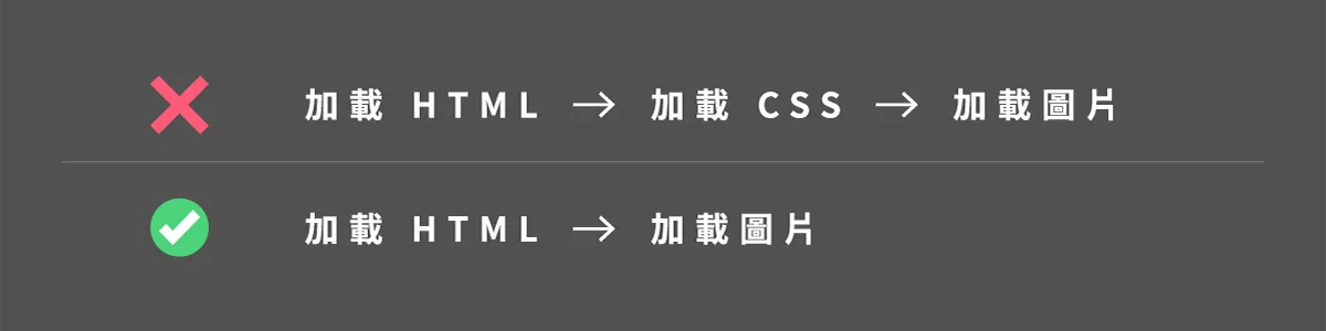
In the case of external styles, it also leads to needing to wait for the CSS to finish downloading before parsing begins, which can affect image loading speed compared to using <img> to introduce images. You need to use inline styles, preload images, preconnect and other methods to avoid this issue.
Usage of <img>
The most common way to add images to a webpage. This element is suitable for most situations, but attention must be paid to the details of its attributes.
Writing Alternative Description alt Attribute
If you care about SEO, you should add a well-described alt for each image and develop the habit of clearly describing the images whenever possible!
Below is a very obvious picture of an orange cat, but if a screen reader or search engines and web crawlers want to understand the content of the website’s images, they will encounter unreadable issues. To solve this situation, it is essential to add an alt attribute to every <img>.

Not writing a good alternative description for images will lead to search engines and some website users being unable to correctly understand the content of the images. You can refer to the “Google Search Center’s recommendations” for better descriptions of webpage images.
<!-- 😟 Bad --><img src="cat.jpg" />
<!-- 😑 Can be better --><img src="cat.jpg" alt="Cat" />
<!-- 😊 Good --><img src="cat.jpg" alt="An orange cat sleeping in the sun on the sidewalk" />
Proper Lazy Loading
Most browsers now support native lazy loading, and you only need to add the loading=lazy attribute. Proper use of lazy loading allows images to load only when they are truly needed.
<img loading="lazy" src="cat.jpg" alt="An orange cat sleeping in the sun on the sidewalk" />Loading Appropriate Sized Images with src-set and sizes
You can additionally use the src-set attribute to load appropriately sized images on the webpage. For example, when an image is displayed on high-resolution devices, a larger image should be used, while a smaller image can be used on low-resolution devices.
<img srcset=" /image.png?width=100 100w, /image.png?width=200 200w, /image.png?width=400 400w, /image.png?width=800 800w"/>In the above example, when the device width is 100px, the 100w image will be used; when the device width is 200px, the 200w image will be used, and so on. Not only “device size,” but also “pixel density” will be taken into account. For example, the 100w image will be used at 200px under a 2x pixel density.
sizes consists of a media condition and size value, separated by commas, and its main function is to let the browser know what size the image will need to be displayed at different device sizes. For example:
<img srcset="" sizes="(max-width: 400px) 200px,(max-width: 800px) 100vw,50vw"/>Taking the above example, the browser knows that the image will be 200px when below 400px, 100vw when between 400px and 800px, and 50vw when above 800px; assuming the current device size is 900px, the image will be 50vw * 900px = 450px in size, and if the pixel density is 2x, it will be 450px * 2 = 900px.
Manually calculating these dimensions is really tedious 😅, so you can use the Responsive Image Breakpoints Generator to calculate automatically, or use RespImageLint for automated checks of whether the image’s srcset and sizes are correct.
Provide Clear Image Aspect Ratio
To avoid layout shifts, it’s best to provide the width and height of the image along with it so the browser knows in advance how much space to reserve for the image:
<img width="600" height="400" />Or use the CSS property aspect-ratio to indicate the aspect ratio of the image:
<img style="aspect-ratio: 4 / 6" ; width="100%" />Asynchronous Image Decoding
Additionally, there is the decoding="async" attribute, which allows the browser to move the image decoding work off the main thread. It is recommended to use it for off-screen images.
<img decoding="async" />Prioritize Image Resource Loading
You can also manually adjust the importance of image fetching, allowing the browser to load truly important images first, such as LCP images.
<img fetchpriority="high" />Or lower the fetching priority, for example, for the later pages of a homepage carousel:
<div class="carousel"> <img fetchpriority="high" /> <img fetchpriority="low" /> <img fetchpriority="low" /></div>Usage of <picture>
Provide Alternative Images
For example, if you want to use the .webp format instead of the current .png, but not every user’s browser supports it, you can use <picture> to provide an alternative image format:
<picture> <source srcset="image.webp" type="image/webp" /> <img src="image.png" alt="Description" /></picture>This means that if the format is supported, the content of the <source> will be used; if not, it will fall back to the <img> for display.
Provide Artistic Image Replacement
Artistic presentation refers to using different images at different device sizes, for example, using one image on a desktop and a different one on a mobile device. A more practical example is that you can use <picture> to display a full logo when there is enough space, but use a simplified small logo when space is limited.
<picture> <!-- Use large image on large screens --> <source media="(max-width: 767px)" srcset="small-logo.png" /> <!-- Use small image on small screens --> <source media="(max-width: 480px)" srcset="tiny-logo.png" /> <!-- Fallback option --> <img src="fallback-logo.png" alt="Logo" /></picture>Summary
My experience is that optimization should be done specifically when website performance issues arise; usually, clear alternative text and image size attributes are sufficient.
- Use
<picture>if you want to display different images based on artistic presentation for different device sizes. - Use
<picture>if you want to provide alternative image formats. - For unimportant background images, you can use
background-image. - Use
srcsetto provide images for different device sizes, and usesizesto specify the size of images for different device sizes. - Use
widthandheightoraspect-ratioto provide the aspect ratio of images. - Use
altto provide alternative text for images. - Use the
loadingattribute to lazy-load images. - Use the
fetchpriorityattribute to prioritize image resource loading. - Use the
decodingattribute to allow the browser to move image decoding work off the main thread.