Introduction
Real-world web pages rarely require CSS Grid for special visuals. Recently, while creating some unique visual web layouts, I found it particularly suitable as an inspirational teaching material for CSS Grid. Thus, I wrote this article to help deepen the understanding of CSS Grid through real-world cases.
Problem
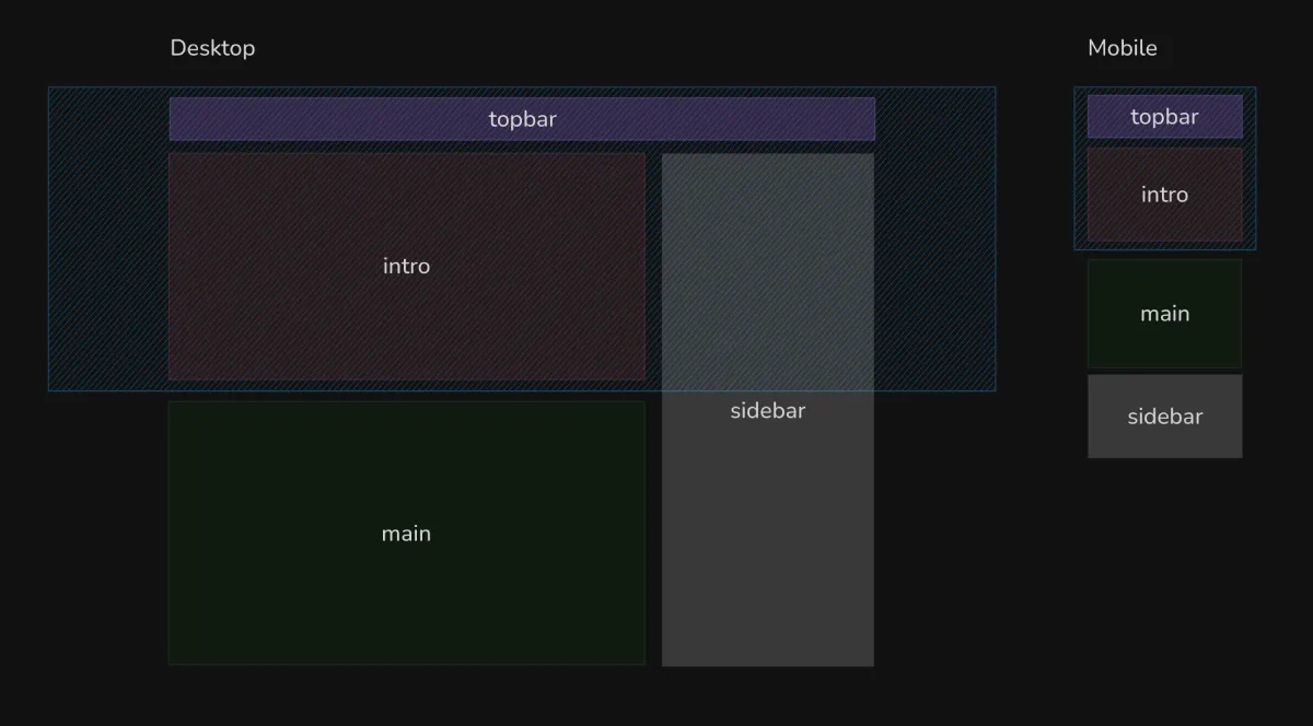
Create two sizes of RWD pages based on the diagram.
Solution
It becomes clear that this layout cannot be achieved using traditional one-dimensional layouts, as the containers they belong to differ between the two sizes.
For example, the sidebar should be contained within the main parent container, but it also needs to align with the top of intro on larger device sizes. Clearly, such a requirement is difficult to achieve with traditional CSS layouts, whether using negative margin to push elements or position: absolute, transform, which can lead to a messy and hard-to-maintain situation, even requiring JavaScript to calculate positions 😐.
At this point, we can rely on CSS Grid to define a two-dimensional layout, assigning child elements to their corresponding areas. Typically, I use tools like CSS Grid Generator to set up the layout. Specifically, we can first outline the appearance of the grid:
.grid {  --max-width-main: 800px; /* Maximum width of main area */  --width-sidebar: 400px; /* Sidebar width */  --height-topbar: 40px; /* Topbar height */
  display: grid;  grid-template-columns:    1fr /* Left side can stretch */    minmax(0, var(--max-width-main)) var(--width-sidebar) /* Main area auto-stretch with max width limit + sidebar */    1fr; /* Right side can stretch */  grid-template-rows: var(--height-topbar) 1fr; /* One layer for topbar, one layer for flexible content */}
Next, we just need to bind each area to its corresponding position. Here, we can see a new syntax being used: subgrid, which allows child elements’ grids to inherit from the parent element’s grid, eliminating the need to redefine the grid.
.header-area {  grid-area: 1 / 1 / 3 / 5;  display: grid;  grid-template-columns: subgrid;}
.topbar-area {  height: var(--height-topbar);  display: grid;  grid-template-columns: subgrid;  grid-area: 1 / 2 / 3 / 4;}
.intro-area {  display: grid;  grid-template-columns: subgrid;  grid-area: 3 / 2 / 4 / 3;}.main-area {  grid-area: 3 / 2 / 4 / 3;}.sidebar-area {  grid-area: 2 / 3 / 4 / 4;}
In actual projects, to ensure compatibility with older browsers, I redefine the same grid in the header area for alignment with other elements, which does not differ much; it’s just the same grid defined again.
Conclusion
See the Pen extended-sidebar-subgrid by Riceball (
@riecball) on CodePen.
Although it is rare to encounter such a special visual in theory, as far as I know, modern UI design software does not have corresponding means to create such drafts. It can only be conveyed by drawing two versions of flat drafts. This is a valuable experience that fully demonstrates the unique advantages of CSS Grid.