Draggable Element to Make Website More Interactive and Fun
Introduction
Recently, I revamped the homepage of the blog and addressed some experience-related issues:
- More appropriate spacing
- Added interactive features and styles for mobile devices
- Clearer titles
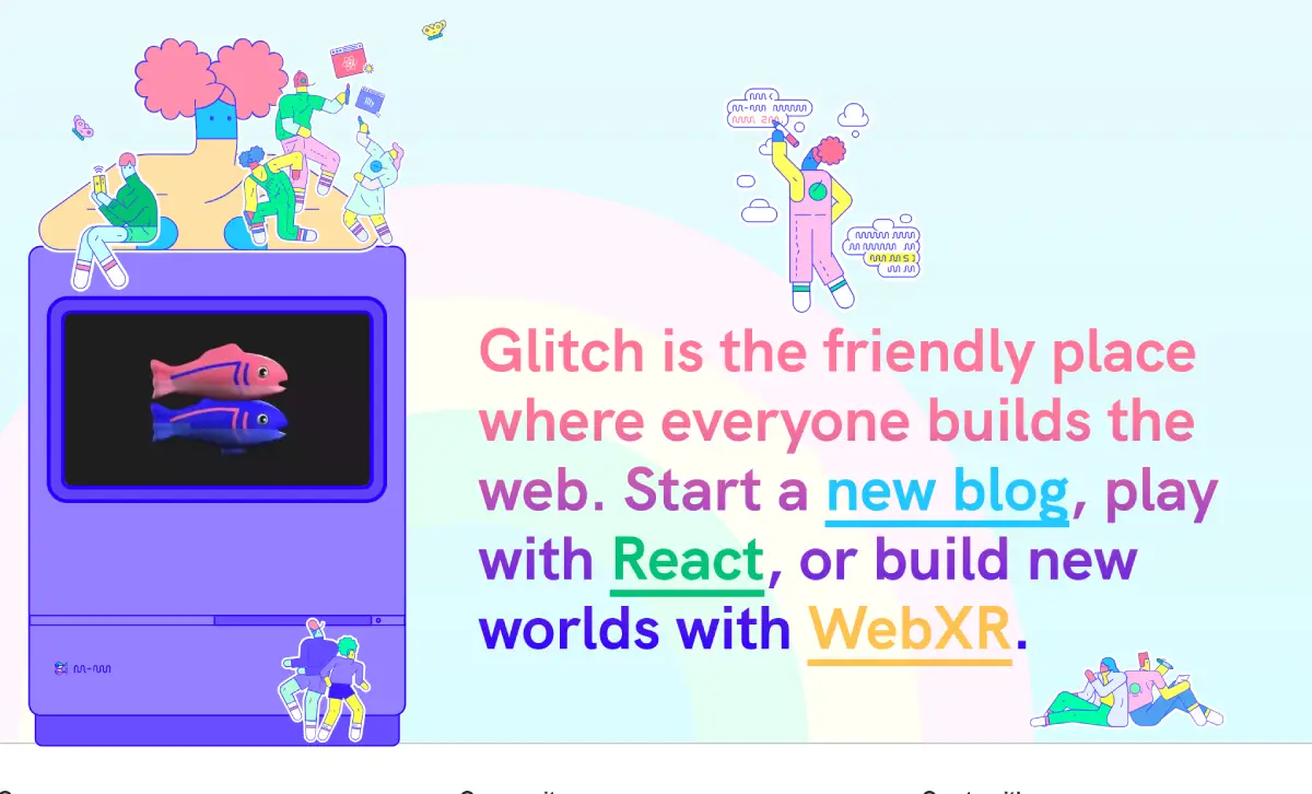
One of the draggable element feature, hides many details worth sharing. I was initially inspired by the draggable stickers on the Glitch website, which resemble movable refrigerator magnets, created using the react-draggable package.
However, considering loading speed and maintainability, the blog opted not to introduce additional packages for a single page effect, so I implemented the related functionality from scratch using the DOM API.
Implementing Draggable DOM Element
You can view the results on the homepage or recreate it using the CodePen below:
See the Pen Drag Text by Riceball (@riecball) on CodePen.
Structure
<span class="relative inline-flex"> <!-- !Hack: Since change element to absolute will cause layout rebuild and weird first grab position, so I create 2 same element here, one is invisible for layout, another one is absolute positioned for user to grab --> <!-- Placeholder --> <span class="invisible hover:-rotate-2 inline-flex items-center gap-1 md:gap-2 border md:border-2 p-1 pr-2 border-current/60 whitespace-nowrap cursor-grab hover:bg-primary/20 hover:text-primary transition"> <!-- icon... --> Design <span class="absolute top-0 left-0 -translate-x-1/2 -translate-y-1/2 size-1 md:size-2 bg-current/60"></span> <span class="absolute top-0 left-1/2 -translate-x-1/2 -translate-y-1/2 size-1 md:size-2 bg-current/60"></span> <span class="absolute top-0 right-0 translate-x-1/2 -translate-y-1/2 size-1 md:size-2 bg-current/60"></span> <span class="absolute top-1/2 -translate-x-1/2 left-0 size-1 md:size-2 bg-current/60"></span> <span class="absolute top-1/2 right-0 translate-x-1/2 size-1 md:size-2 bg-current/60"></span> <span class="absolute bottom-0 left-0 -translate-x-1/2 translate-y-1/2 size-1 md:size-2 bg-current/60"></span> <span class="absolute bottom-0 left-1/2 -translate-x-1/2 translate-y-1/2 size-1 md:size-2 bg-current/60"></span> <span class="absolute bottom-0 right-0 translate-x-1/2 translate-y-1/2 size-1 md:size-2 bg-current/60"></span> </span> <!-- Real --> <span id="draggable" class="absolute hover:-rotate-2 inline-flex items-center gap-1 md:gap-2 border md:border-2 p-1 pr-2 border-current/60 whitespace-nowrap cursor-grab hover:bg-primary/20 hover:text-primary transition"> <!-- icon... --> Design <span class="absolute top-0 left-0 -translate-x-1/2 -translate-y-1/2 size-1 md:size-2 bg-current/60"></span> <span class="absolute top-0 left-1/2 -translate-x-1/2 -translate-y-1/2 size-1 md:size-2 bg-current/60"></span> <span class="absolute top-0 right-0 translate-x-1/2 -translate-y-1/2 size-1 md:size-2 bg-current/60"></span> <span class="absolute top-1/2 -translate-x-1/2 left-0 size-1 md:size-2 bg-current/60"></span> <span class="absolute top-1/2 right-0 translate-x-1/2 size-1 md:size-2 bg-current/60"></span> <span class="absolute bottom-0 left-0 -translate-x-1/2 translate-y-1/2 size-1 md:size-2 bg-current/60"></span> <span class="absolute bottom-0 left-1/2 -translate-x-1/2 translate-y-1/2 size-1 md:size-2 bg-current/60"></span> <span class="absolute bottom-0 right-0 translate-x-1/2 translate-y-1/2 size-1 md:size-2 bg-current/60"></span> </span> </span>I duplicated an identical editing box and used the invisible style to hide it to prevent it from being displayed or read by screen readers. This is because it’s found that dynamically changing an element’s layout properties using JS will force the entire layout to be recalculated. To achieve a “natural picking up” effect, the element must initially float on the screen. While this is a somewhat hacky approach, it significantly improves the experience of picking it up without layout jitters.
Logic
const draggable = document.getElementById("draggable");
let posX = 0;let posY = 0;
const grabbingStyle = [  "bg-primary/20",  "text-primary",  "-rotate-2",  "cursor-grabbing"];
function getClientX(e) {  return e.touches ? e.touches[0].clientX : e.clientX;}
function getClientY(e) {  return e.touches ? e.touches[0].clientY : e.clientY;}
function moveElement(e) {  e.preventDefault();  draggable.style.left = `${getClientX(e) - posX}px`;  draggable.style.top = `${getClientY(e) - posY}px`;}

function dragStart(e) {  e.preventDefault();  draggable.classList.add(...grabbingStyle);  posX = getClientX(e) - draggable.offsetLeft;  posY = getClientY(e) - draggable.offsetTop;
  window.addEventListener("mousemove", moveElement, false);  window.addEventListener("touchmove", moveElement, { passive: false });}function dragEnd() {  draggable.classList.remove(...grabbingStyle);  window.removeEventListener("mousemove", moveElement, false);  window.removeEventListener("touchmove", moveElement, false);}
draggable.addEventListener("mousedown", dragStart, false);draggable.addEventListener("touchstart", dragStart, { passive: false });
window.addEventListener("mouseup", dragEnd, false);window.addEventListener("touchend", dragEnd, false);
Since mobile devices do not have hover pseudo-elements, it’s naturally impossible to create styles using CSS in that way. However, you can still listen for touch events through the DOM and apply styles.
First, obtain the target selection box and set up mousedown and touchstart event listeners, and ensure that during dragging, we also set up mousemove and touchmove event listeners, keeping an eye on adding and removing the grabbing animation effect.
The events (e) that come from the event listeners will pass through specially designed functions to determine “if it’s a touch event, return the corresponding coordinate values”.
function getClientX(e) {  return e.touches ? e.touches[0].clientX : e.clientX;}
function getClientY(e) {  return e.touches ? e.touches[0].clientY : e.clientY;}
Calculate “the distance from the click position to the top-left corner of the element,” using the top left corner coordinates of the clicked element as the baseline.
posX = getClientX(e) - draggable.offsetLeft;When moving, use preventDefault to prevent default event actions, such as: preventing text selection, preventing page scrolling on touch devices. Set the left and top positioning of the element “according to the current click position, making the element drag according to the originally clicked position.”
function moveElement(e) { e.preventDefault(); draggable.style.left = `${getClientX(e) - posX}px`; draggable.style.top = `${getClientY(e) - posY}px`;}Conclusion
By dynamically listening to and changing an element’s styles with JS, we achieve an interactive DOM element effect using a programmatic approach. I believe many people learning frontend development want to create and experiment with frontend effects themselves. However, writing everything from scratch using native APIs can be quite tedious and inefficient 😅, like building a tall building with sticks.
- Imagine that if there are multiple elements needing listening in the future, considering OOP or FP might ensure scalability.
- For performance, using
transformto move calculations to the GPU may offer better performance than directly changingleftortop. - To manage frequent event triggering, throttling to reduce update frequency or using
requestAnimationFrame()might be helpful.