Introduction
As both a web designer and developer, I have summarized the common issues encountered in the collaboration between design and development over the past few years, such as:
- User Interface: How many sizes of web pages do I need to create?
- Frontend: How many breakpoints do I need to set for the web page?
Whenever these questions arise, I always observe the practices of other design or style libraries, such as Bootstrap, which has 6 default breakpoints:
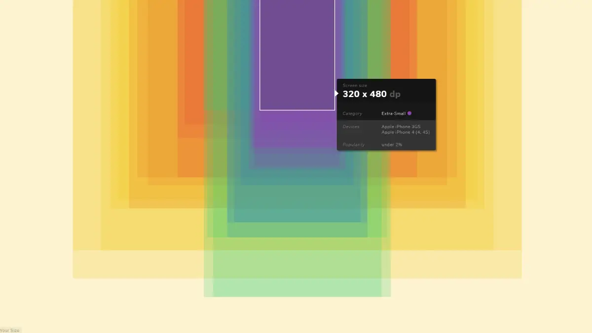
- Extra small - (< 576px)
- Small - sm (>= 576px)
- Medium - md (>= 768px)
- Large - lg (>= 992px)
- Extra large - xl (>= 1200px)
- Extra extra large - xxl (>= 1400px)
These values are based on the fact that they are multiples of 12 (Bootstrap’s grid system is set to 12 columns) and common device sizes, but in reality, this is not an absolute guideline. This article mainly aims to explore how modern responsive web pages should be implemented and why I ultimately concluded that fewer size versions are better.
Arguments
AWD and RWD Have Different Starting Points
If you are still struggling with how a web page should be presented at specific sizes when creating it, it is likely that you are thinking about how to create a responsive web page from the perspective of creating an AWD web page. AWD emphasizes providing specific designs for specific devices; while RWD emphasizes providing flexible designs that adapt to various device sizes. They aim to achieve the same goal: “to have content reasonably configured across different device sizes.”
Adaptive design uses different containers to hold content, while responsive design allows content to flow freely to adapt to the container.
- Adaptive: Provides specific designs for specific device sizes.
- Responsive: Automatically adjusts the layout and style of the web page based on device size.
Your RWD Might Still Be a Bunch of AWD
Whether you are a designer or a developer, it is very easy to default to AWD thinking when creating interfaces, because the appearance of a web page at a specific size is a concrete fact that is easy to communicate and define. This approach was indeed popular in the early stages of web development, but as technology has evolved, the public’s expectations for interfaces have changed. Nowadays, there is a general expectation that the same web page should provide a good user experience on TVs, tablets, phones, and even watches, making RWD rather than AWD the mainstream trend.
So since we are moving towards content that adapts freely, we should not be fixated on the appearance of specific size interfaces! As long as the final web page can have a reasonable configuration across different sizes (providing a good user experience), that is the goal, rather than getting caught up in the appearance at specific sizes, because it will never be fully designed and developed.
The AWD way of thinking: “I need to design unique styles for specific device sizes” is destined to only be suitable for planning web pages from the overall page → content, creating one independent and fragmented interface after another; while the RWD approach: “I can start from the content → overall page, and formulate flexible responses,” will greatly enhance the reusability of content styles and realize the concept of modular web pages.
We all desire a concrete goal to guide us in developing a new interface, but this is unrealistic because the user’s device sizes and resolutions are uncontrollable factors. Therefore, choosing a more flexible standard to evaluate whether the web page can truly adapt to various scenarios is a more practical and efficient direction.
Breakpoints are just one way to achieve responsiveness
If a webpage has 6 breakpoints, then that style element needs to be tested in 6 different ways, and the cost of such testing and maintenance is very high!
A breakpoint is a method to achieve responsive web design, but it is not the only method. Many developers habitually view breakpoints as a necessary step in creating responsive webpages, because early CSS did not provide many ways to design flexible content, and often required manually setting breakpoints to achieve reasonable layout configurations.
Modern CSS has provided many flexible sizing units, such as grid, flexbox, vh, vw, calc, clamp, min, max, and aspect-ratio, which allow us to adapt more freely to different screen sizes without being limited to fixed breakpoints. If possible, breakpoints should be avoided to let content flow resolve layout issues, and should only be used when there is a significant need for layout changes.
- ✔ Fine-tuning text size or spacing scale: Use dynamic units like Clamp or rem
- ✔ Major changes in layout: Use breakpoints to adjust layout configurations
Taking the homepage of Web Dong as an example, it uses grid for two-dimensional layout, flex for one-dimensional layout, and clamp for text size transitions, only setting breakpoints when there are major layout changes (designing the mobile navigation bar at the bottom of the page). Besides breakpoints, there are actually many ways to achieve responsiveness.
Webpages are inherently responsive
Web content itself flows like water, changing its presentation based on device size. This can be referenced in the article This is a motherfucking website., which, although a bit crude, points out many issues with modern webpages.
Flashy interfaces might break the web content. In reality, the essence of any HTML webpage is that its content is fluid. Does excessive design merely add interference and increase the difficulty of development and maintenance? Here, excessive design refers to the idea that if reasonable content configuration can be achieved through content flow, why add extra decorations for unnecessary embellishments?
Conclusion
Only through collaboration between design and development can a well-maintained webpage be created. Depending on the type of product and target audience, the applicable models will differ. This article presents three points to persuade you on how many versions of UI design or breakpoints are needed to develop a “responsive website.” From a frontend perspective, each additional breakpoint means another version of styles that need to be managed and maintained. The means to achieve responsiveness today are very diverse, and breakpoints should only be used when truly necessary.
How UI can be done
Webpages of a certain scale are pieced together from small components to the overall page, as per the concept of Atomic Design. If one still thinks that “responsive web development is designed based on pages rather than content,” it will be difficult to maintain a consistent product quality interface. If time pressure prevents building the system from small to large, various design systems can be referenced or discussing with frontend teams to choose a user-friendly component library is also a good solution.
- Understand that webpages are not just like flat paper; leave more clues and discuss with the frontend about the design goals. (Compared to refined Mockups, Wireframes or casual sketches that explain the intended goals of the interface will be better, or make good use of modern tools for annotations)
- Maintain the design system together with the frontend, starting with standardizing small components.
What Frontend Can Do
Try to avoid reinventing the wheel by writing reusable and maintainable components. It’s not just about making UI; more often, the work should focus on the overall quality and maintainability of the project.
- Provide suggestions to help the UI team better understand the limitations and possibilities of the frontend.
- Maintain the design system together with the UI, starting with standardizing small components.
Further Reading
- 5 simple tips to making responsive layouts the easy way - Kevin Powell
- Designing for the Unexpected - A LIST APART