Future of the Web - Native Web Components
Introduction
I have known for a long time that browsers began to introduce Web Components related APIs and standards, but I never had the chance to use this technology in practice.
I wanted to write this article to document my findings as the application scope of Web Components has been expanding over time, and I can also see major frameworks gradually supporting native Web Components. For example, Swiper also recommends transitioning to a version implemented with Web Components, Vue and Web Components, and React Custom HTML elements also mention how to work with Web Components.
Therefore, I took the opportunity to learn about the relevant knowledge and analyze how it differs from existing solutions.
What are Web Components
Web Components are a set of browser API standards that allow developers to create custom, customizable, and independent HTML elements in a client-side environment. They can be used in any modern browser environment without the need for additional frameworks or tools.
Many front-end developers have encountered frameworks like Vue, React, and Angular and are familiar with the concept of components they provide. But specifically, how do Web Components differ from these frameworks as a native browser feature?
- Native Support: Web Components exist as native APIs in the browser, so there is no need to build any environment to use them.
- Limitations: Web Components are designed for use in client-side environments and cannot provide server-side rendering (SSR) capabilities like modern frameworks such as Next and Nuxt.
- Community Support: In terms of current community support, modern front-end frameworks have far greater support than Web Components. Most have developed a complete set of solutions early on, making it not easy to replace Web Components immediately. However, it is certain that the introduction of this standard will consolidate the front-end implementation of component UI.
Creating Web Components
Let’s first create a custom hello-world element and then explain step by step:
class HelloWorld extends HTMLElement {  constructor() {    super(); // Call the constructor of the parent class (HTMLElement Class)    this.innerHTML = '<h1>Hello World</h1>';  }}
window.customElements.define('hello-world', HelloWorld);
You can see that the entire process of creating a custom element is very simple. First, create a class that inherits from HTMLElement, then set the content of the element in the constructor, and finally register the element using the window.customElements.define method, allowing you to freely add the newly defined element in HTML.
<hello-world></hello-world>You can add any attributes, methods, or events you want to the element and place it anywhere on the page, just like any HTML element! The only thing to note is that there are certain naming conventions that must be followed: Valid custom element names.
Lifecycle
Web Components have corresponding lifecycle methods:
constructor(): Initializes the element instance.connectedCallback(): Called when the element is inserted into the DOM.disconnectedCallback(): Called when the element is removed from the DOM.attributeChangedCallback(): Called when the element’s attributes are added, removed, or updated.
You can perform operations based on the lifecycle in custom elements according to your needs, for example: binding event listeners when the element is added to the DOM and unbinding them when removed.
Shadow DOM
Manipulating the page DOM has long been a familiar approach for front-end developers, but its extensibility is not very good. The reason is that we cannot ensure that the styles and behaviors of custom elements will not be affected by external factors. This is where Shadow DOM comes into play.
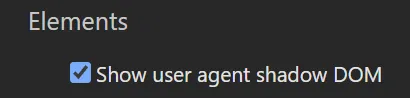
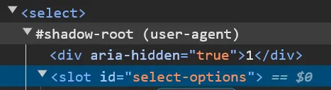
Take the native HTML <Select> element as an example; you will find that different browsers have created some DOM that is independent of the overall webpage by default. This is because they use Shadow DOM. You can open the user agent shadow DOM settings to observe how various browsers implement different elements.
You would want custom elements to have completely independent styles and behaviors like <Select>, and this is where Shadow DOM comes into play.
Step 1: Create Shadow DOM Root
Based on the previous HelloWorld example, we can create the Shadow DOM Root in the constructor using the attachShadow method, setting the mode to determine whether we can modify the Shadow DOM through this.shadowRoot after creation.
class HelloWorld extends HTMLElement { constructor() { super(); const shadowRoot = this.attachShadow({ mode: 'open' }); // open & closed allows the creation of ShadowDom and whether it is allowed to modify }}Step 2: Create Template
After creating the Shadow DOM Root, you can create the corresponding template elements and styles:
const template = document.createElement('template');template.innerHTML = `<style> h3 {color: green}</style><h3 data-title></h3>`;Step 3: Insert Template into Shadow DOM
Using cloneNode + deep parameter, you can insert all the template content into the Shadow DOM. You can also search and modify elements in the shadowRoot. For example, the previously created template has a data-title attribute embedded, and you can easily change its content through JS by searching for the element with that attribute:
shadowRoot.appendChild(template.content.cloneNode(true));shadowRoot.querySelector('[data-title]').innerText = 'foobar';Slot
<slot> is a built-in HTML element in Web Components, a placeholder used to represent the content injected into custom elements. For example, how should the content injected into the hello-world custom element be handled?
<hello-world> <span>Foobar</span></hello-world>You can arrange it using slot:
const template = document.createElement('template');template.innerHTML = `<style> h3 {color: green}</style><h3 data-title> <slot></slot></h3>`;Named Slot
You can distinguish multiple slots using the name attribute:
const template = document.createElement('template');template.innerHTML = `<h3><slot name="title" /></h3><p><slot name="content" /></p>`;And specify the corresponding slot name in HTML using the slot attribute:
<hello-world> <span slot="title">Title</span> <span slot="content">Content</span></hello-world>Implementing a Counter
Let’s implement a simple counter component using Web Components:
class Counter extends HTMLElement {  constructor() {    super();    this.count = 0;    this.attachShadow({ mode: 'open' });  }
  connectedCallback() {    this.render();    this.shadowRoot.querySelector('[data-increment]').addEventListener('click', () => this.increment());    this.shadowRoot.querySelector('[data-decrement]').addEventListener('click', () => this.decrement());  }
  increment() {    this.count++;    this.updateCount();  }
  decrement() {    this.count--;    this.updateCount();  }
  updateCount() {    this.shadowRoot.querySelector('[data-count]').textContent = `Count: ${this.count}`;  }
  render() {    this.shadowRoot.innerHTML = `      <style>        :host {          display: block;          text-align: center;        }        button {          font-size: 1rem;          padding: 0.5em 1em;          margin-top: 1em;        }      </style>      <div data-count>Count: ${this.count}</div>      <button data-increment>Increment</button>      <button data-decrement>Decrement</button>    `;  }}
customElements.define('app-counter', Counter);
Summary
The simple project above reveal that after creating Web Components, compared to other mature JS framework packages, it is more like a standard API for customizing DOM elements at a lower level. Compared to the current complex front-end demands:
- Declarative and concise efficient template system
- Reactive state and corresponding cross-component communication
- Server-side rendering
Web Components lack all of these 😅 and will not replace existing solutions. However, we can expect more implementations of web components to align with the native browser API. Additionally, lightweight packages fully based on Web Components, such as Lit, are also worth keeping an eye on.
Further Reading
- The Story of Web Components - uidotdev
- Web Components Crash Course - Traversy Meid
- Vue and Web Components - Vue.js
- What Are Web Components? - Syntax
- Web components - JavaScript.INFO