Introduction
I encountered an interesting front-end UI problem that required a comprehensive understanding of front-end development to solve. So I documented my thought process.
Problem: Cinema Seat Selection System
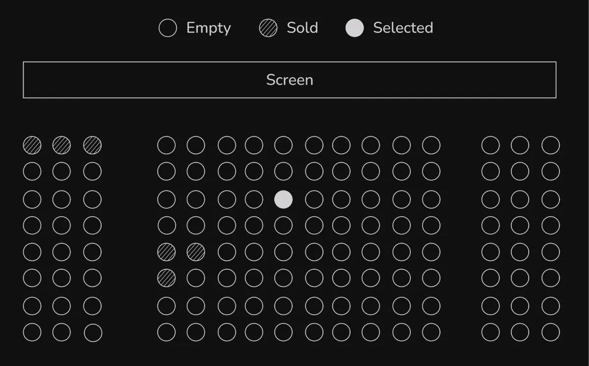
As a front-end engineer, how would you implement the cinema seat selection system shown above?
- Users can select any available seat to change its status to “selected.”
- Users cannot click on sold-out seats.
- Styles can be freely designed, as long as they meet the core functionality.
- Create an additional button that can submit the selected seats when clicked.
What technical challenges do you expect to encounter, and how will you solve them?
Solution
This problem includes layout design, user interaction, edge case handling, and backend communication, making it a comprehensive topic with both breadth and depth.
Step 1: Clarify Requirements
The original problem only provided the most basic requirements, but it’s best to confirm if there might be any additional requirements before implementation. Extra details can significantly impact the final implementation structure and also showcase how you would address real-world issues.
- Is there a possibility of needing to sell multiple seats in the future, making seats selectable in multiple ways?
- Could there be different states for seats in the future? For example, VIP seats, wheelchair seats, etc.
- What does “sold” mean? If payment is required to consider a seat sold, how should we handle situations where a user selects a seat only to find out it has already been sold? To avoid users discovering they cannot purchase at the last moment, should there be a mechanism to update or verify seat status?
- What does the data structure for defining seat formats look like?
- Is there a possibility of having different types of seat layouts?
Step 2: Layout Design
From a semantic web perspective, users can submit their selections using a <form> element combined with <input type="radio"> to manage styles and states. Anticipating that form element styles may vary across browsers and are difficult to modify, I will visually hide the <input> elements completely and customize the seat appearance through interaction with <label>.
<form> <label class="seat"> <input name="seat" type="radio" class="visually-hidden" checked /> </label> <label class="seat"> <input name="seat" type="radio" class="visually-hidden" disabled /> </label> <label class="seat"> <input name="seat" type="radio" class="visually-hidden" /> </label></form>:root { --color-primary: #15964e; --color-disabled: #dddddd; --border-disabled: var(--color-disabled);}
.seat { --seat-background: transparent; --seat-border: var(--border-disabled); --seat-border-width: 2px; width: 1rem; height: 1rem; background-color: var(--seat-background); border-width: var(--seat-border-width); border-style: solid; border-color: var(--seat-border); border-radius: calc(infinity * 1px);}
.seat:has(input[type='radio']) { cursor: pointer;}
.seat-active,.seat:has(input[type='radio']:checked) { --seat-background: var(--color-primary); --seat-border: var(--color-primary); cursor: auto;}
.seat-disabled,.seat:has(input[type='radio']:disabled) { --seat-background: var(--color-disabled); --seat-border: var(--color-disabled); cursor: auto;}
.visually-hidden { position: absolute; width: 1px; height: 1px; padding: 0; margin: -1px; overflow: hidden; clip: rect(0, 0, 0, 0); white-space: nowrap; border-width: 0;}In terms of web layout, most cinema seat groups are theoretically rectangular, so CSS Grid can be considered for layout. This makes it easier to control the size and spacing between seat groups.
As shown in the example below, you can create two custom layout styles for the center and sides based on your needs, and use variables to manage spacing uniformly. If there are expansion needs, corresponding styles and templates can also be dynamically generated.
<form id="seat-form" class="seats"> <div class="seats-side"></div> <div class="seats-center"></div> <div class="seats-side"></div></form>.seats { --seats-gap: 0.5rem; display: flex; justify-content: space-between;}
.seats-center { height: 100%; display: grid; gap: var(--seats-gap); grid-template-columns: repeat(9, minmax(0, 1fr));}
.seats-side { height: 100%; display: grid; gap: var(--seats-gap); grid-template-columns: repeat(3, minmax(0, 1fr));}Step 3: Data
Currently, the data for each seat needs to store three states: available, selected, and sold. My strategy is to default all seats to available status (the most common state) and record the seat coordinates and status when needed, which can reduce unnecessary data transmission during updates.
Currently, I am using Map to store seat data, simply because it has a clean API and allows for quick and intuitive data status lookup. Using an object would also be a good choice, as shown in the example below:
const seats = new Map([ ['center-1', { isUnavailable: true }], ['right-1', { isUnavailable: true }], ['left-1', { isUnavailable: true }],]);Using blocks as coordinates is one way, but later I thought that using xy axes as coordinates might be closer to reality, as cinema seats are usually represented with two-dimensional coordinates. Perhaps a large grid can be generated through the number of seats + number of blocks + spacing data, and each seat can be assigned corresponding xy values to display in specific areas.
Keeping the seat status updated in real-time is also crucial. I thought perhaps using Long polling or WebSocket to maintain a connection with the server could allow for timely updates when seat statuses change.
Summary
After this thought process, I quickly implemented a simple cinema seat selection system through Vue. Ultimately, the specific technology used is not too important; the key is that familiar frameworks allow me to quickly realize my ideas, focusing on responding to business needs and obtaining results and feedback rapidly.
See the Pen seat-map-2 by Riceball (
@riecball) on CodePen.